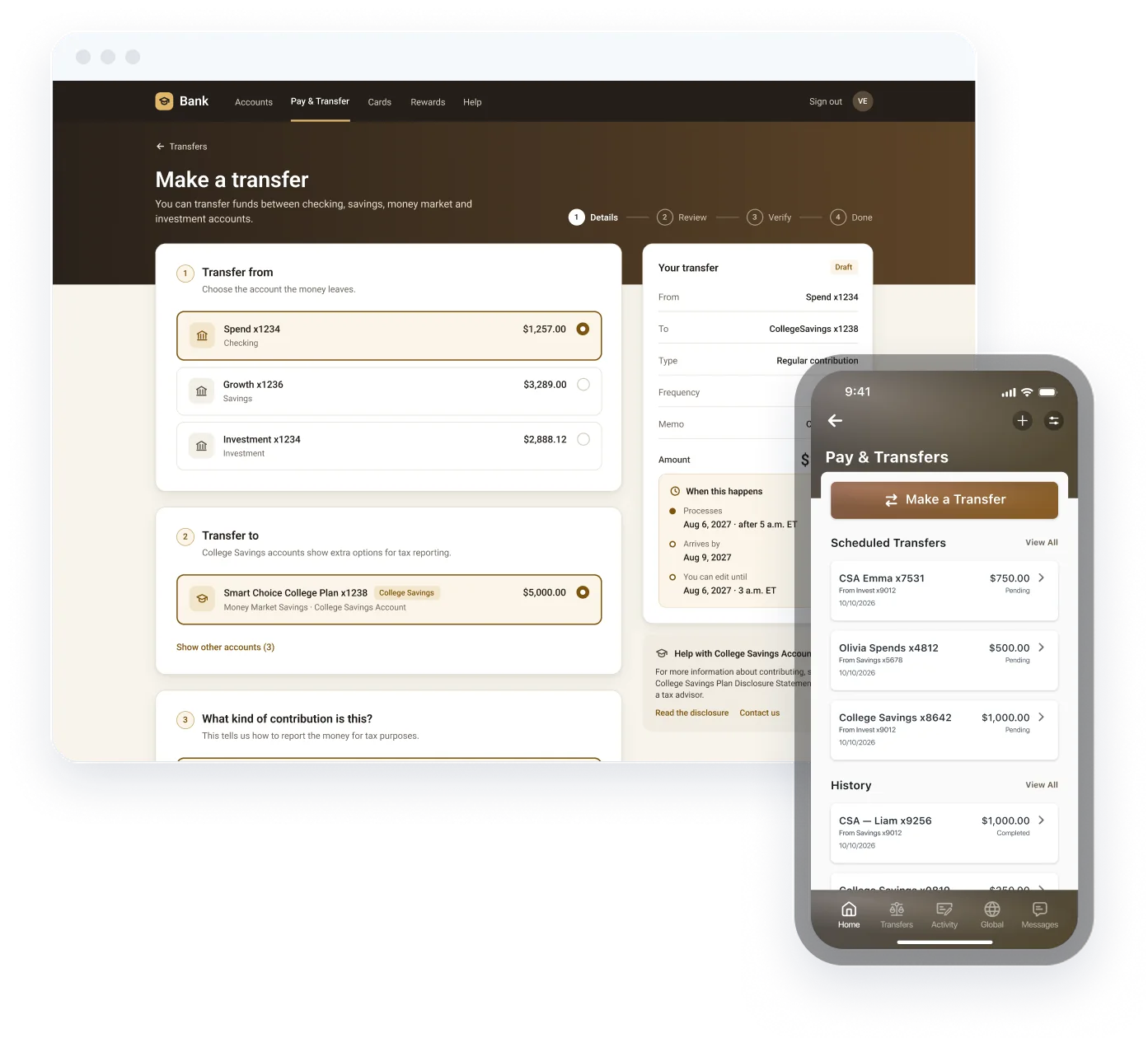

Understanding the problem
A savings transfer that is also a tax decision
- 01
The background
College Savings Account (Smart Choice College Plan money market) is a tax‑advantaged account. Every dollar moving in or out has to be recorded as the right kind of transaction, not just as a transfer.
- 02
The problem
The standard “Make a Transfer” wizard treats every account the same. It can’t capture contribution type, can’t tell customers when a transfer isn’t possible online, and doesn’t explain when money actually moves. 529 plans hold about $603B in 17.7M accounts (ICI, 2025), and a mis-timed recontribution carries tax and a 10% penalty.
- 03
The opportunity
Extend the existing transfer experience, rather than build a separate one, so CSA owners can contribute, withdraw, schedule, edit and cancel transfers with the guidance a tax‑advantaged account needs.
How might we
How might we let account owners move money into and out of a College Savings Account as easily as any other transfer, while making sure every transaction is classified correctly and nothing happens that can’t be undone?
Understanding users and workflows
Turning plan rules into product behavior
Research approach
- Reviewed the CSA account requirements and the Confluence MVP brief with product and compliance.
- Walked the CSA process map (account opening journey) to see where transfers fit.
- Audited the existing transfer wizard, Transfer Activity and mobile flows.
- Ran early mapping in FigJam and content explorations with content design.
- Requirements sessions with product and compliance, built from the:
- CSA account requirements, the MVP brief and the CSA process map
- A heuristic audit of the existing transfer, activity and mobile flows
- A review of public 529 rules (IRS recontribution and rollover guidance)
- And form-usability research.
Key insights
1 · Contribution type is a tax choice, not a form field
Regular contribution, recontribution (within 60 days) and rollover carry different rules. Owners need plain‑language definitions at the moment of choice.
2 · Some transfers can’t happen online
Rollovers need documents and a banker. The product has to stop early and point to the right channel.
3 · Timing changes outcomes
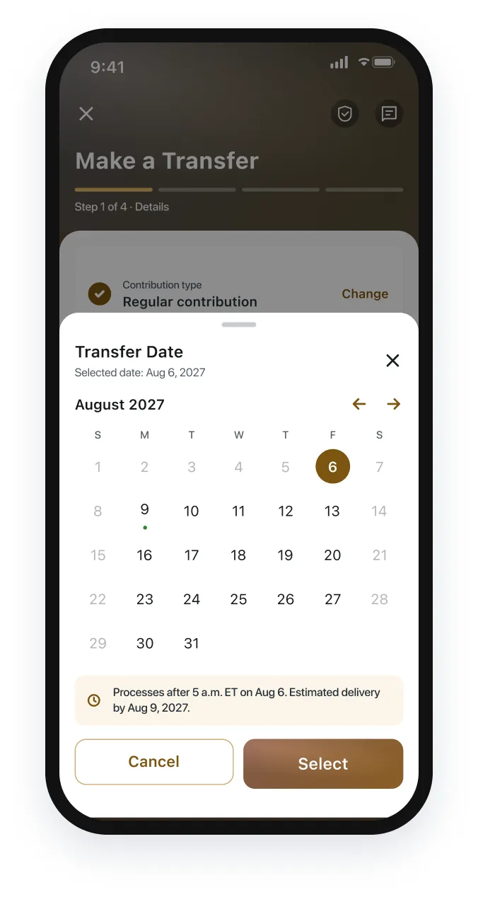
Cutoff times decide the processing date and delivery date, and how long a transfer can still be edited.
4 · Recurring transfers need clear edit semantics
“Edit the next one” and “edit the whole series” are different actions with different consequences.
Defining the experience
One guided page, many rules
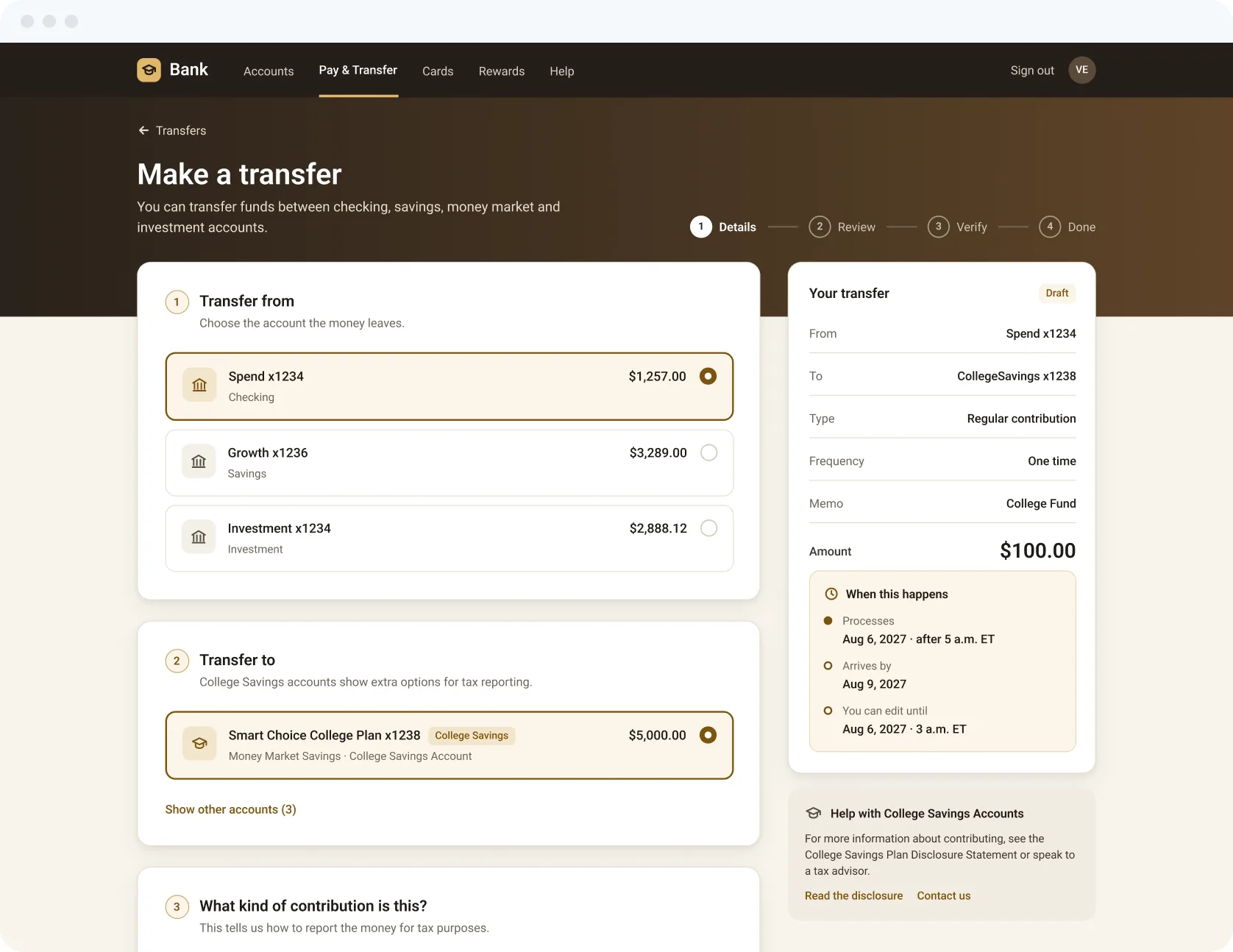
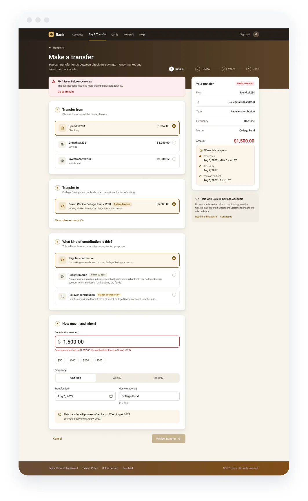
Instead of a 5‑step wizard of dropdowns, the contribution flow becomes one guided page: each decision is a visible question card, answered steps collapse, and a live summary shows what will happen and when. Choosing a College Savings account reveals the extra questions, so customers with other accounts see nothing new.
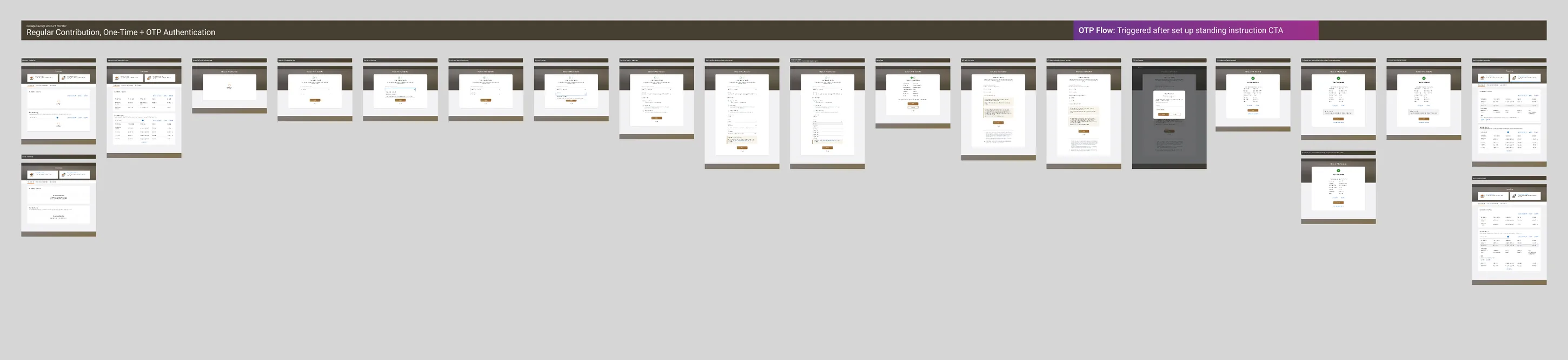
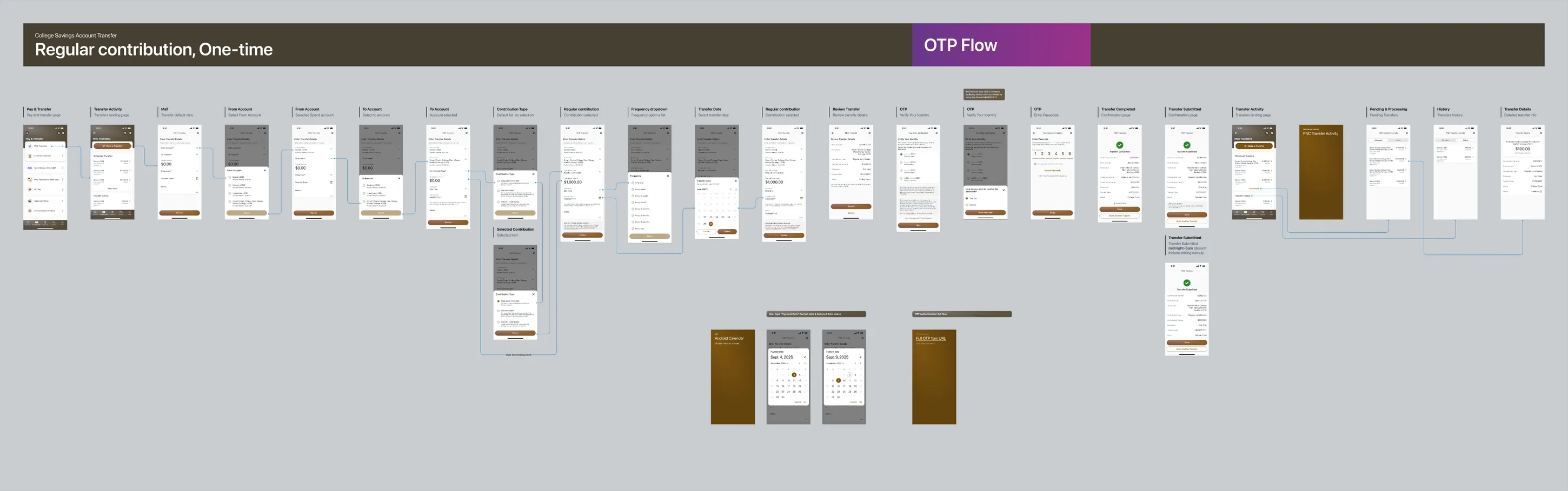
Primary journey · one‑time contribution
- Transfer hub
- Enter details
- Contribution type
- Review
- Verify identity (OTP)
- Confirmation
- Transfer Activity
Branches designed for each step
- Rollover · hard stop
- Validation errors
- Transfers unavailable
- Cutoff‑time variations
- Recurring: weekly / monthly
- Recontribution
- Edit next / edit series
- Delete transfer
Principles & constraints
Progressive disclosure
CSA‑only fields appear only after a College Savings account is chosen.
System first
Reuse Ledger components (wizard, container, dropdowns, notes) so engineering ships faster and patterns stay consistent across WBA and MBF.
Say what happens, and when
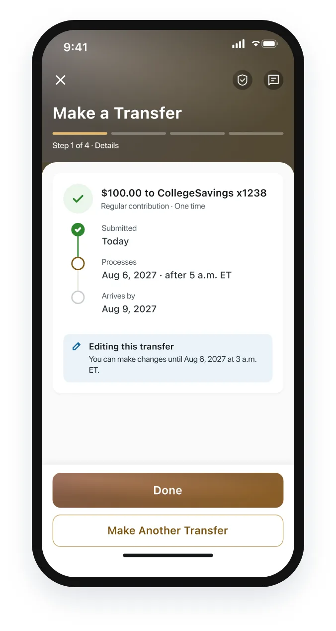
Every review and confirmation states processing time, delivery date and edit window.
Governed delivery
Each flow passed component & technical review, LOB, mobile peer, governance, and pre‑check / submission gates, with a11y annotations.
Key design features and decisions
Five moments that carry the experience
FEATURE 01
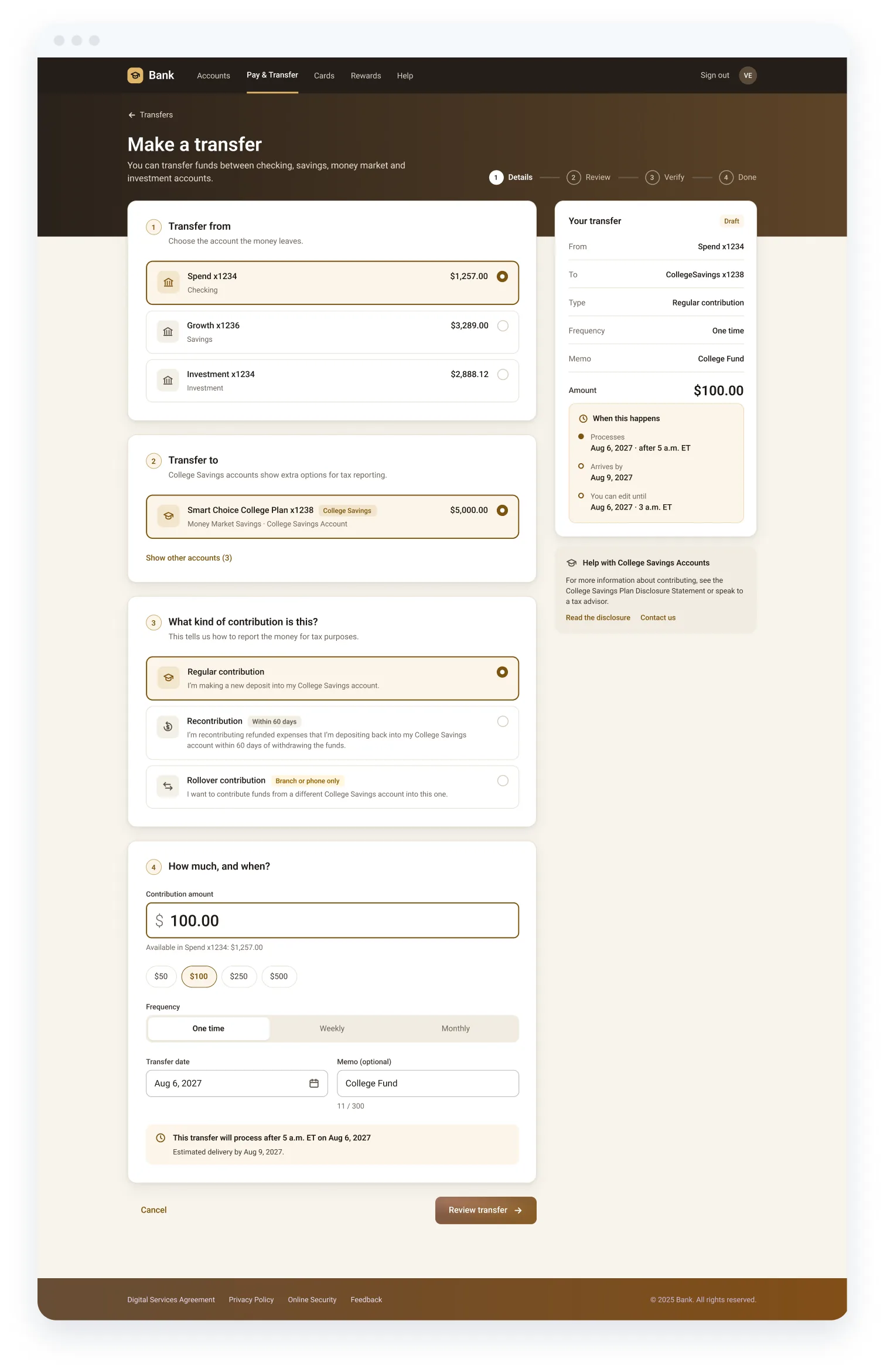
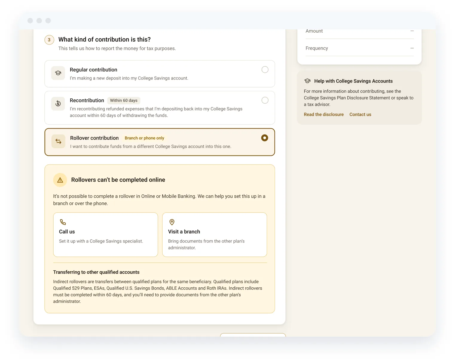
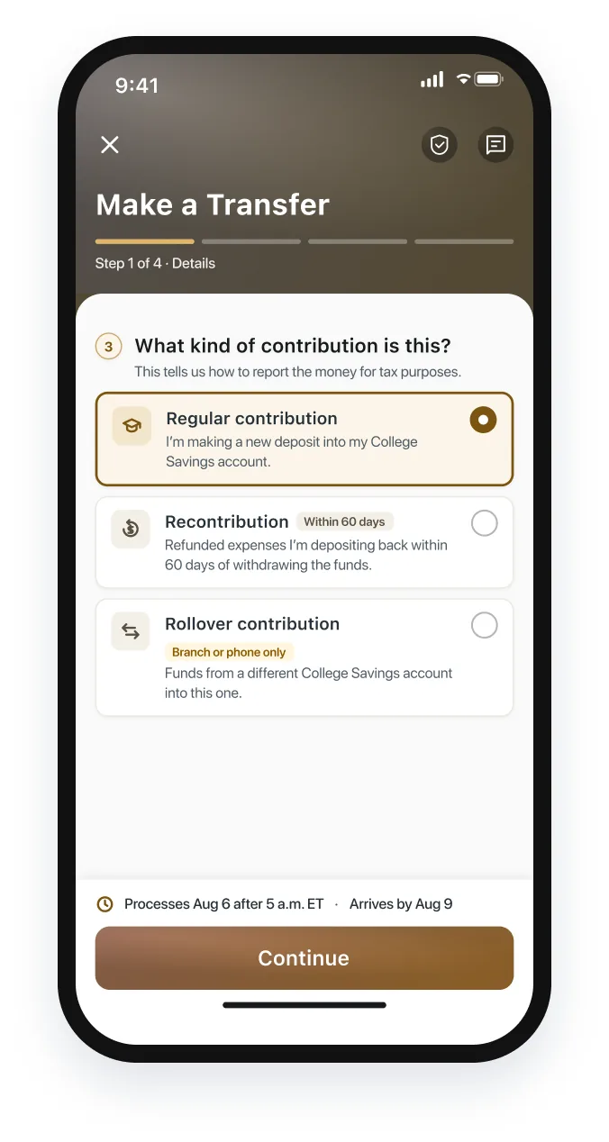
Choosing a contribution type in plain language
- User need
- Owners know they want to “add money to college savings”, not which IRS category it falls under.
- Design approach
- Once the CSA is chosen, a “What kind of contribution is this?” card appears with three choice cards. Each is written from the owner’s point of view: “I’m making a new deposit…”, “I’m recontributing refunded expenses… within 60 days”.
- Choice cards with first‑person descriptions
- Rules (60 days, branch or phone only) shown as tags
- On mobile the same cards sit above a sticky timing bar
FEATURE 02
A hard stop that still moves people forward
- User need
- Rollovers between qualified plans can’t be completed in Online or Mobile banking. Letting someone fill out the whole form first would waste their time.
- Design approach
- Choosing Rollover stops the flow right on the card: a clear note, “Call us” and “Visit a branch” options, and a short explainer of indirect rollovers (529 plans, ESAs, ABLE, Roth IRAs; 60‑day window), so the next step is obvious.
- The result
- No dead ends: the customer knows why, and where to go next.
FEATURE 04
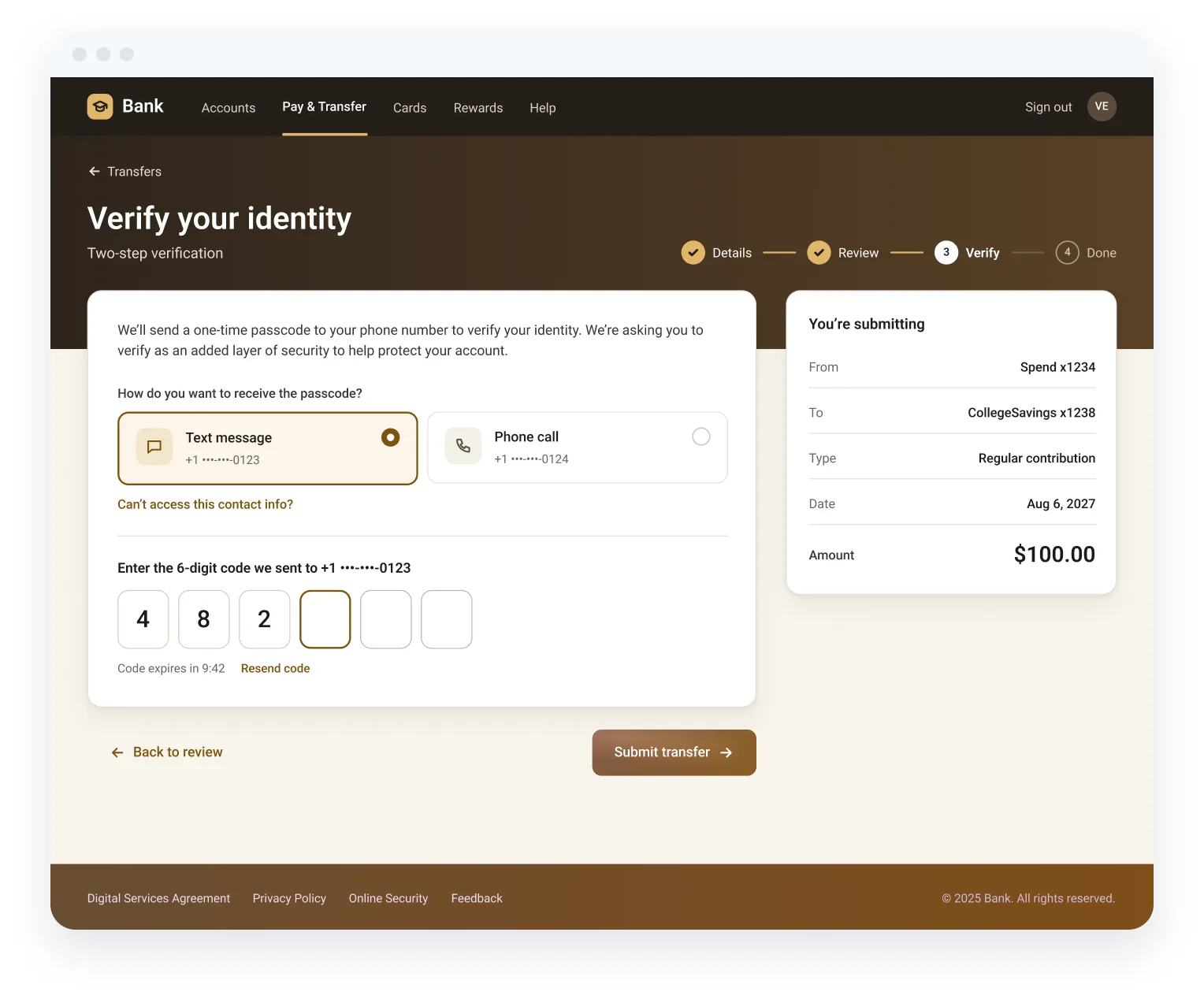
Step‑up verification
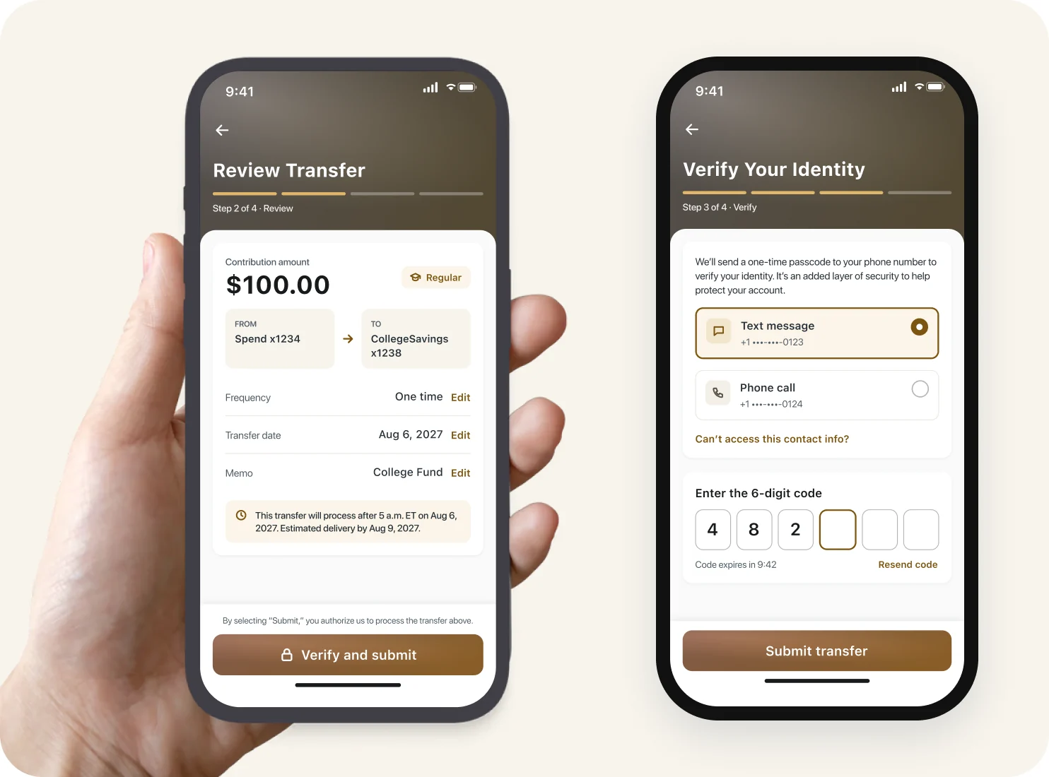
A one‑time passcode protects the transfer before it’s submitted. Method cards, 6‑digit entry, a resend timer and the transfer recap stay in one view, so it never feels like a detour.
FEATURE 05
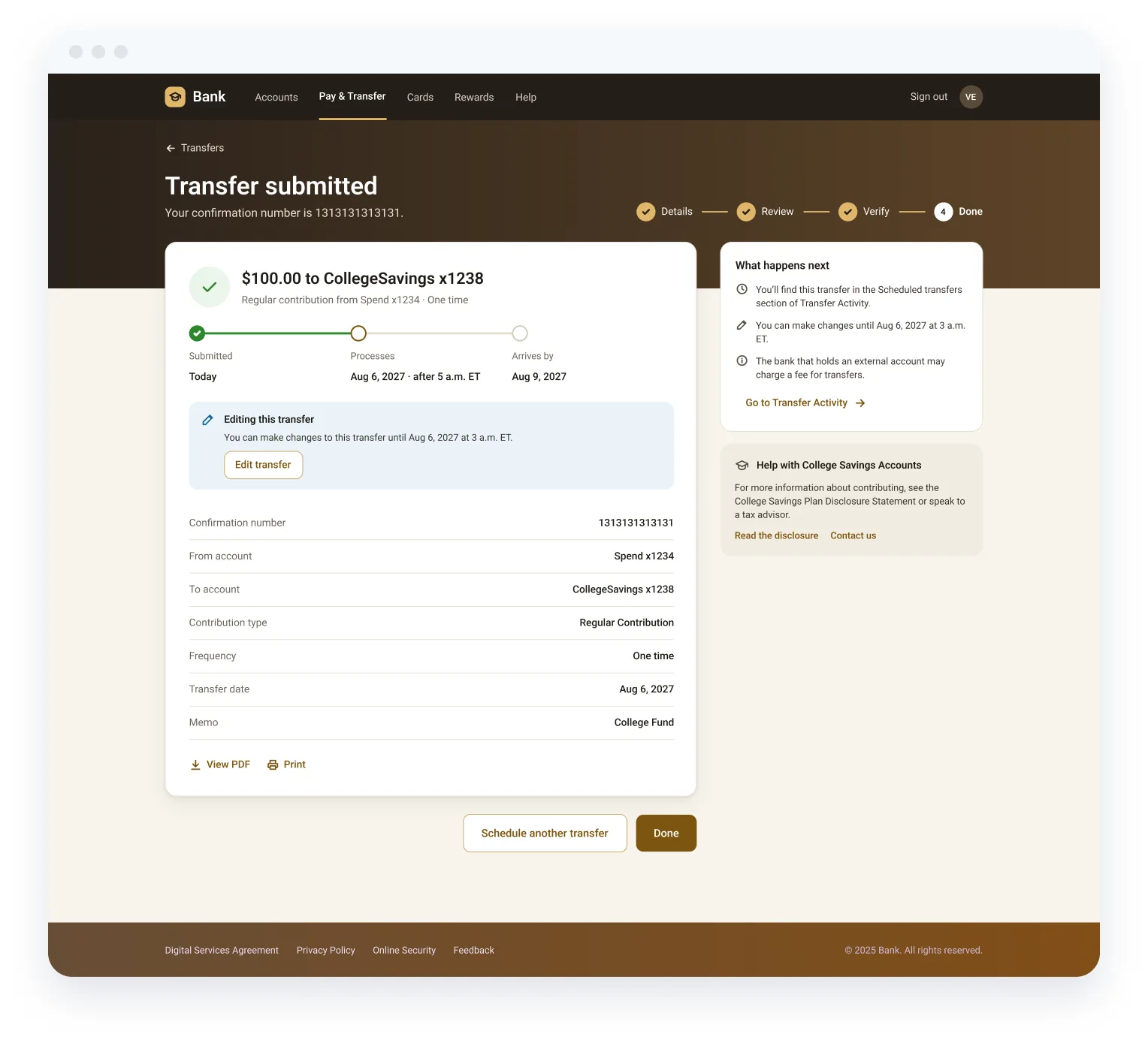
Confirmation with an edit window
The confirmation shows a Submitted → Processes → Arrives timeline, the confirmation number, the full summary, PDF / print, and an “Editing this transfer” callout with the exact deadline and an Edit button.
Testing and refinement
Designing for when things don’t go to plan
Every flow went through structured review: component & technical, line‑of‑business, mobile peer, governance, then pre‑check and submission. A11y annotations were attached to each flow. Validated through six formal review gates: component and technical, line of business, mobile peer, governance, and two compliance pre-checks. Accessibility annotations were included on every flow. The design also follows Baymard’s finding that short option lists work better as visible choices than as drop-downs; in their testing, 55% of users opened drop-downs just to see the options.
Validation. Errors are summarized at the top with a jump link, the field explains the limit, and Review stays disabled until it’s fixed.
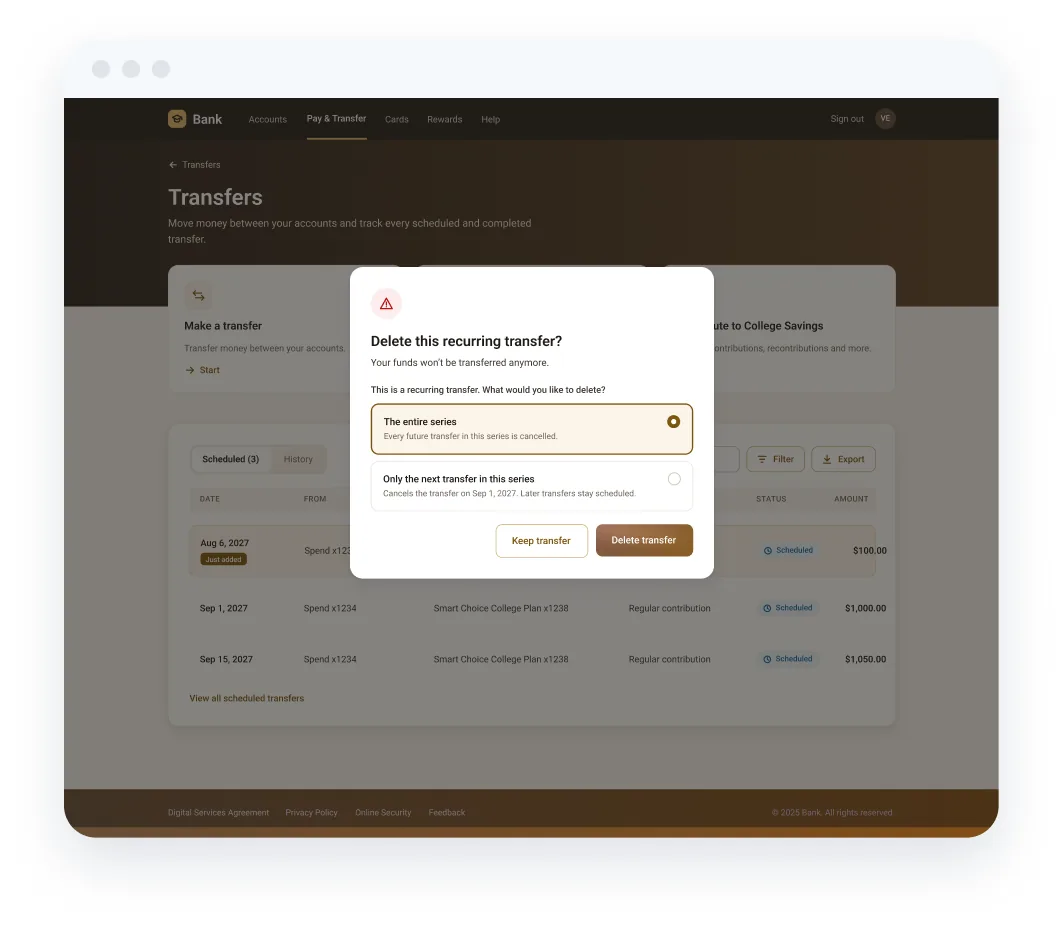
Delete with intent. A focused dialog asks: the entire series, or only the next transfer?
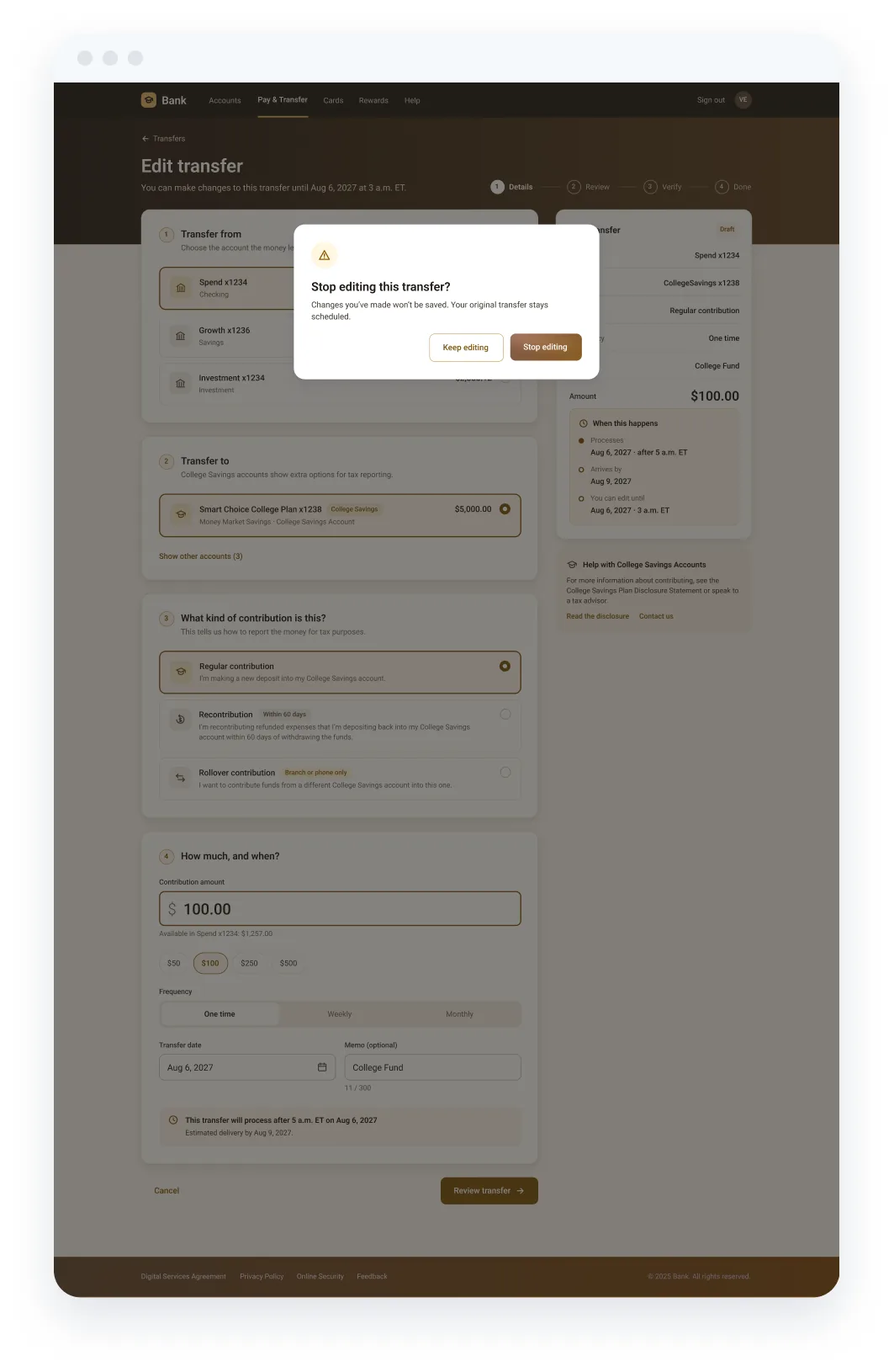
Safe exits. Leaving an edit mid‑way confirms first, and the original transfer stays scheduled.
Iteration log
Before: Recurring transfers said “last day of the month.” A reviewer asked whether that meant the last business day, a real ambiguity when the month ends on a weekend.
After: Designed separate, explicit options for month-end scheduling. Also split the confirmation by submission time (8 p.m.–midnight versus midnight–5 a.m.), so the edit-window message appears only when an edit is actually possible.
Bringing everything together
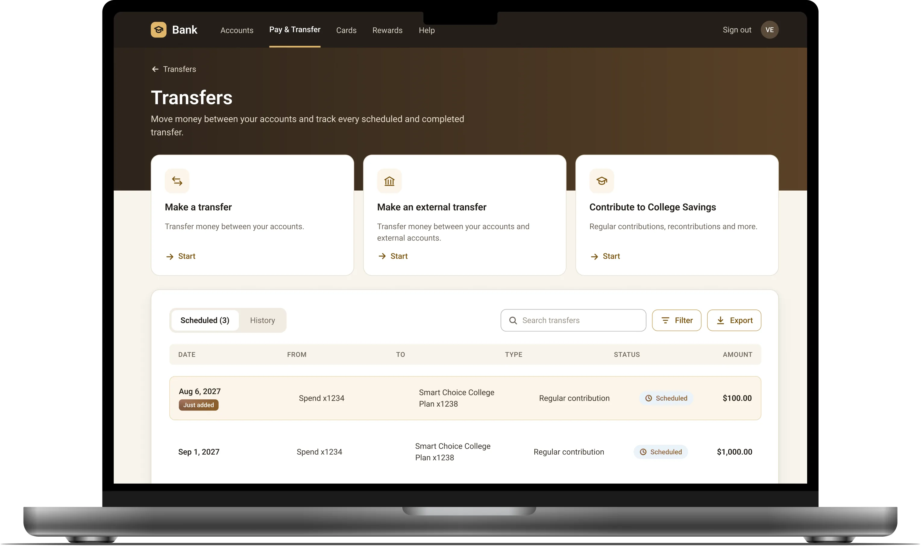
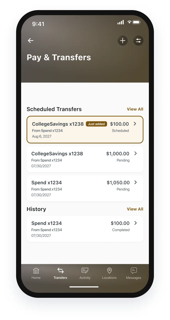
From Transfers hub to Transfer Activity, on every screen size
Mobile app (MBF)
Transfer Activity
Enter details
Transfer date
Confirmation

Native app: review and verify
The same concept in the native app: question cards, a sticky timing bar and a gold primary action, built on the new mobile style with the prism header and tab bar.
Impact and reflection
What shipped, and what I’d take forward
- The outcome
Dev‑ready MVP flows
Contribution, withdrawal, recurring, edit and delete flows, with error and cutoff states, across WBA (responsive) and MBF. Delivered as MVP V1 dev-ready flows for web and native, with accessibility review in progress. The guided-page design is a post-handoff concept.
- The impact
Metric
How success would be measured: fewer misclassified contributions needing manual correction, fewer support calls about rollovers (the flow now redirects them up front), higher online completion of CSA contributions, and fewer edits started after the cutoff window.
- What I learned
Rules are content
The hardest problems were wording and timing, not layout. Pairing early with content design and compliance made the rules feel like guidance instead of fine print. The hard part was rules, not layout. Working with content design and compliance early turned fine print into plain choices.
With more time I would…
I’d test whether real account owners can tell the contribution types apart, and measure drop-off at each step. I’d also add a contribution tracker on the account page, showing yearly totals against gift-tax limits and progress toward the plan’s lifetime maximum.