A fresh and improved experience of form and portal for submitting and modifying adjusters' and policyholders' claims.
Client
Enservio
Role
Design Lead
Duration
6 month
Location
Westlake, Texas, US
Submit Claim
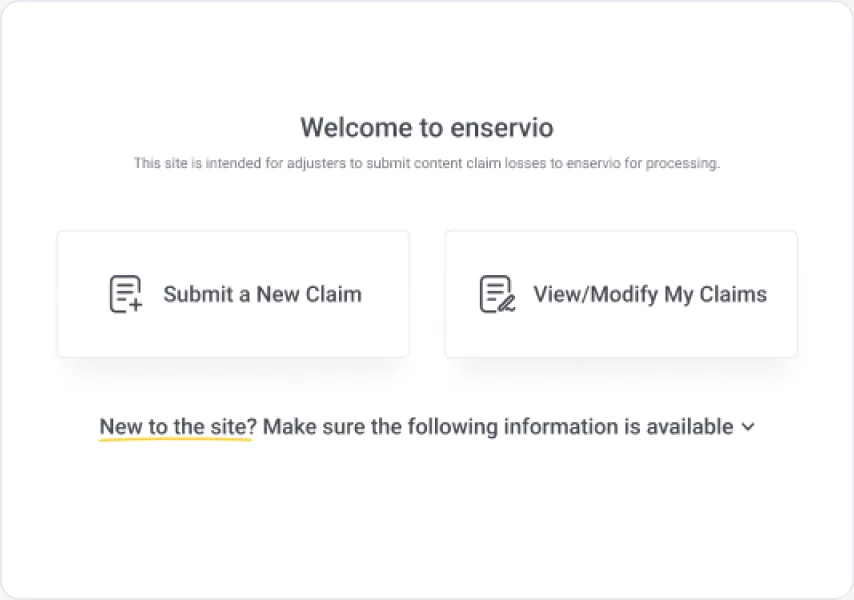
Submit a new claim for review and processing
Modify Claim
Request enservio team to modify my claim
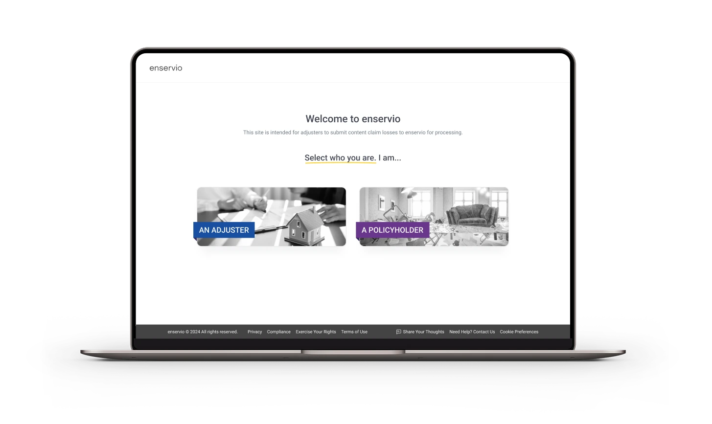
A redesign of enservio's Submit a Claim portal, where insurance adjusters hand off contents-loss claims for inventory, valuation and settlement — and later come back to add items, receipts or instructions to a claim already in progress.
02 · The Challenge
Understanding the problem
Every contents claim enservio processes starts on this form. If the adjuster picks the wrong service or skips the inventory, the claim stalls before anyone can work on it.
01
The background
Adjusters (handling and carrier) submit contents claims to enservio and choose from 11 services, from contents valuation to onsite inventory and live scribe. The portal had to replace a legacy WordPress implementation.
02
The problem
A long single form with dense service descriptions, unclear required fields and no guard against submitting without an inventory. Adjusters who needed to update a claim had no self-serve path.
03
The opportunity
Break the form into a guided wizard, explain each choice where it's made, and validate early so enservio gets a complete, workable claim the first time.
PROBLEM STATEMENT
How might we create a simpler, more intuitive search experience that lets shoppers narrow a large inventory to a confident shortlist while reducing filter overload and price uncertainty?
03 · Discovery & Research
Understanding users and workflows
I mapped how adjusters move from "I have a loss" to "enservio has everything it needs", using the product requests, the existing flow and stakeholder reviews.
Product request & story review
Existing-flow audit
Stakeholder reviews
UI QA rounds
How an adjuster moves through the portal
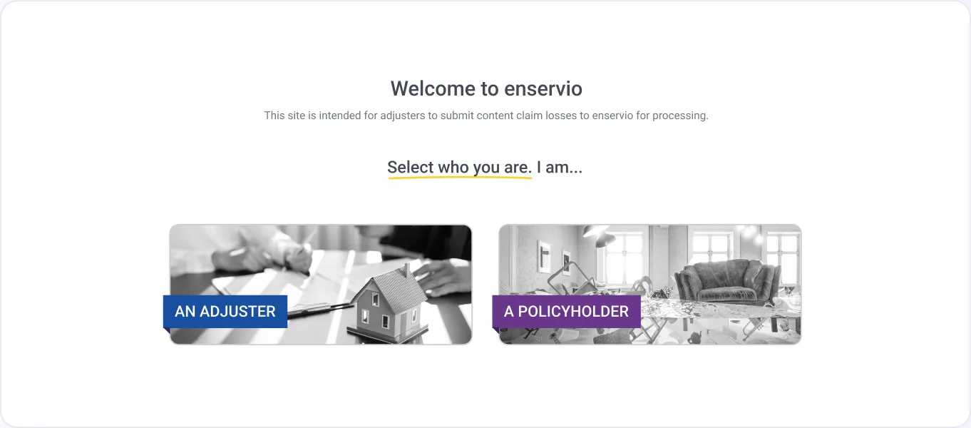
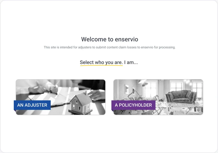
Land on WelcomeIdentify as adjuster or policyholder
Choose a pathSubmit new claim · View/Modify claims
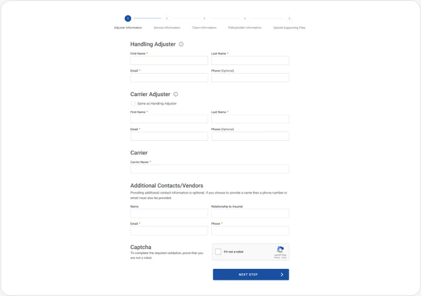
Who is handling itHandling + carrier adjuster, carrier
Five labelled steps; completed steps turn into links so adjusters can jump back without losing data.
Two-column fields
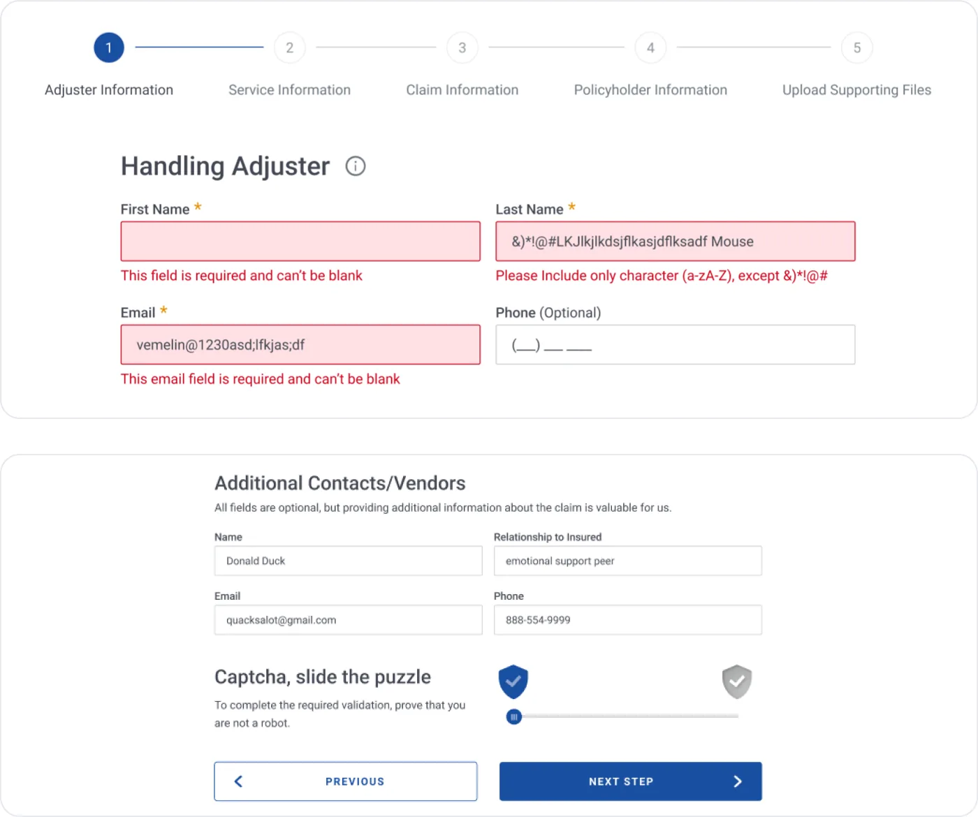
Paired fields, an orange asterisk for required and "(Optional)" spelled out where it's not.
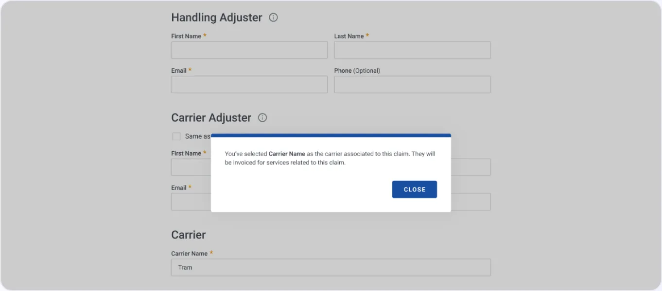
Standard modal
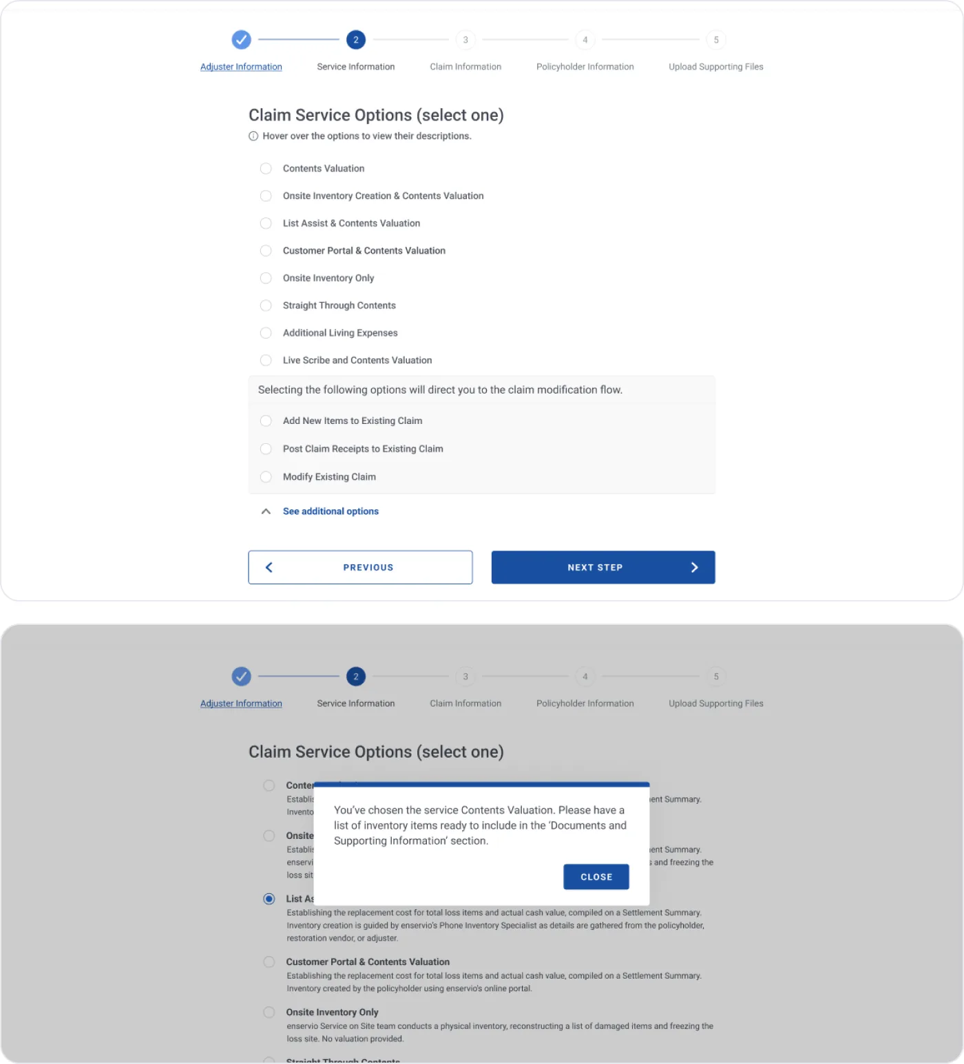
One modal pattern with a blue top bar for confirmations, warnings and session messages.
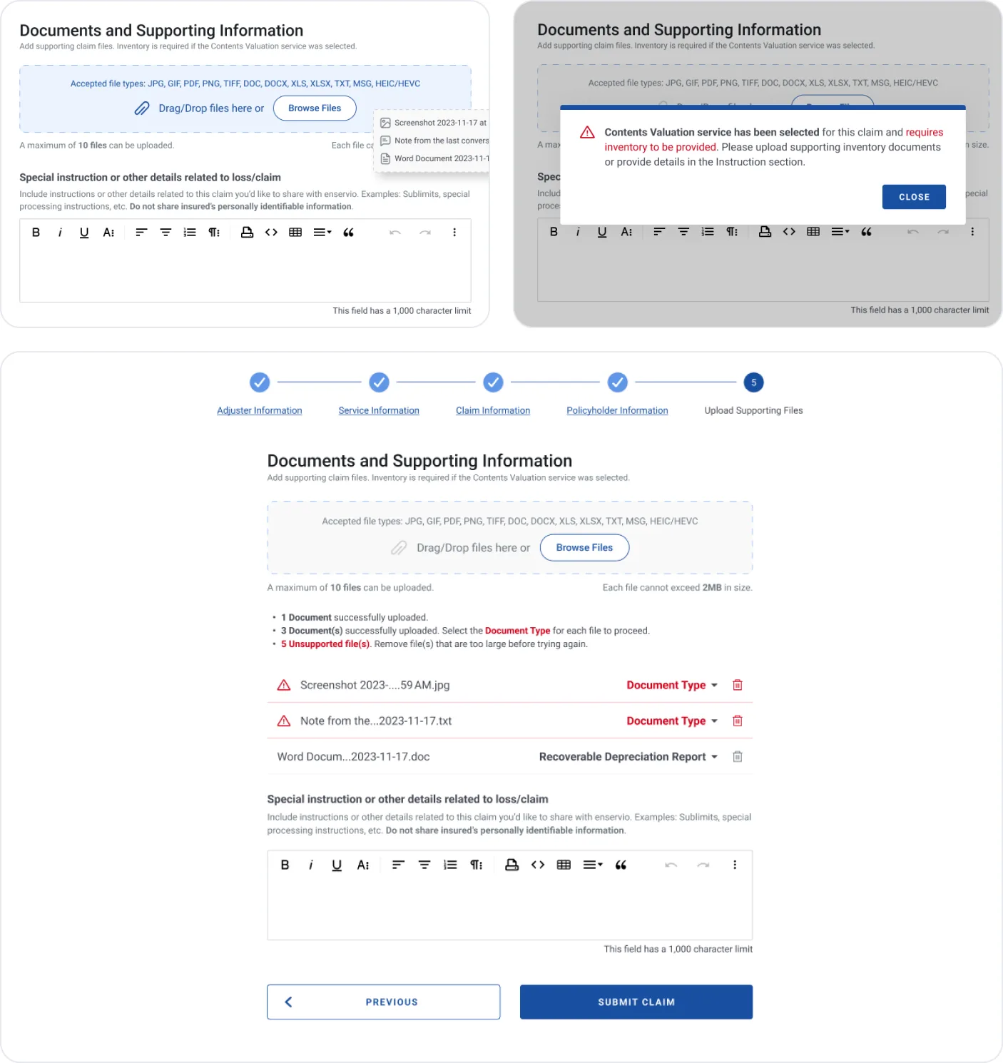
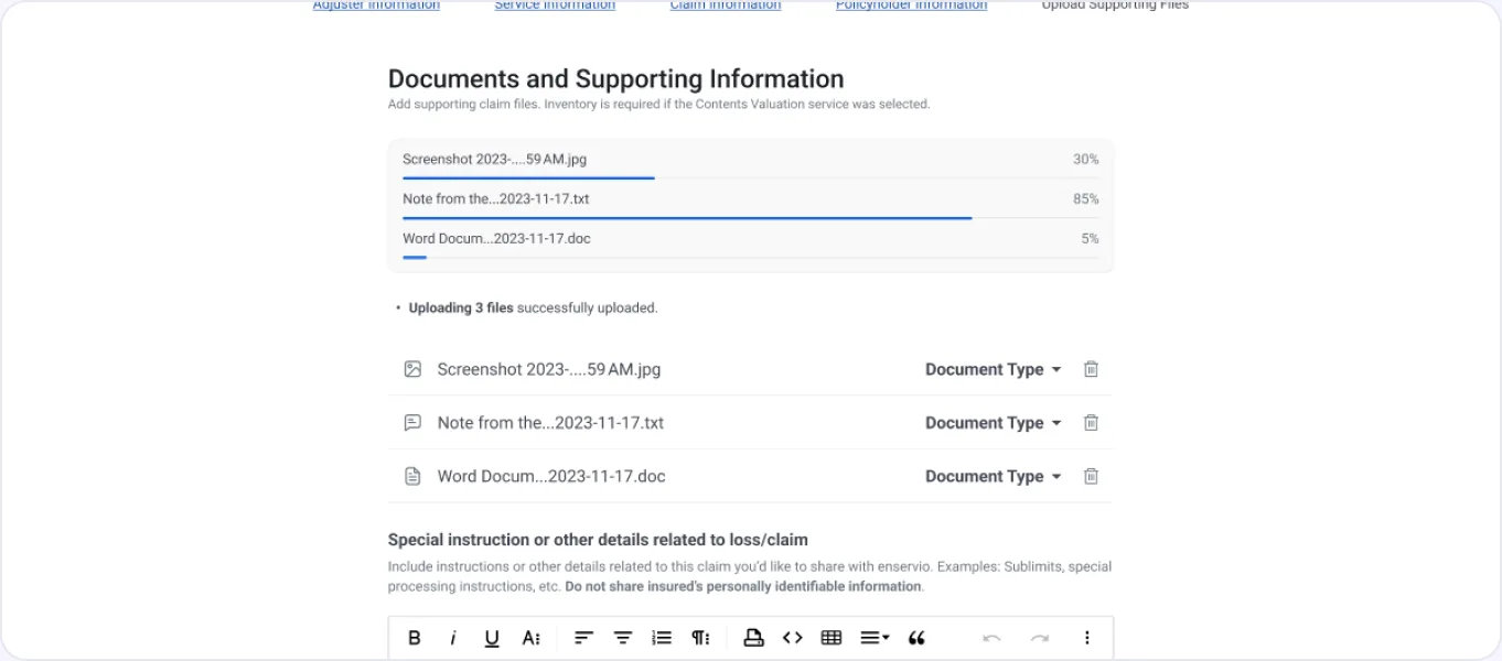
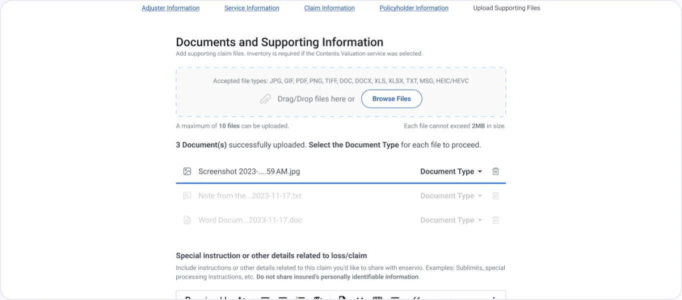
Upload manager
Drop zone, per-file progress, document-type selector and delete for every file.
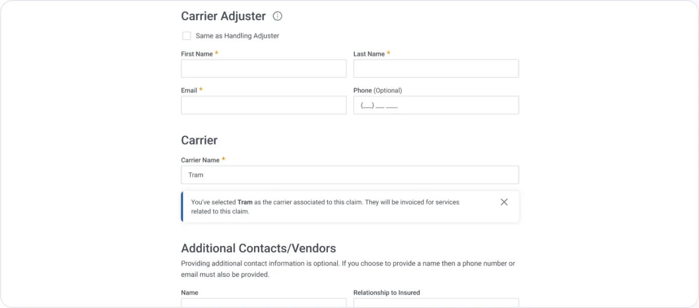
Inline alerts
Dismissible notices with a colour-coded side bar for info, warning and error.
Typeahead
Carrier and policy-form search against database values, with a custom-value fallback.
Rich-text instructions
Formatted notes with a 1,000-character limit and a reminder not to share PII.
Tooltips
Info icons on section titles explain roles such as Handling vs Carrier Adjuster.
Constraints that shaped the design
10Files max per claim, each capped at 2 MB
13Accepted file types, JPG to HEIC/HEVC
1,000Character limit on special instructions
OTPSend passcode, resend timer, 15-minute lock after limits
90Days of claims shown on the dashboard
BotreCAPTCHA required before the 1st step of completion
Desktop · XL≥ 1280 px — designed at 1512 px
Tablet · MD768 – 1239 px
Mobile · SM320 – 767 px
05 · The Solution
Key design features and decisions
Five stories that explain the most important decisions in the flow.
FEATURE 01
A guided five-step wizard
The challenge
One long form hid how much was left and mixed unrelated questions together.
The design decision
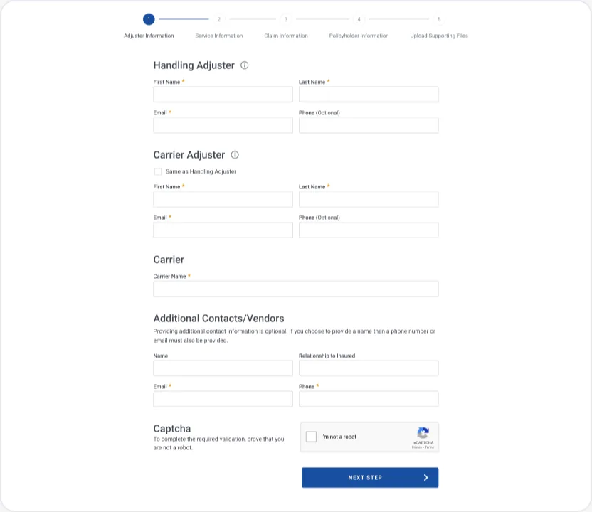
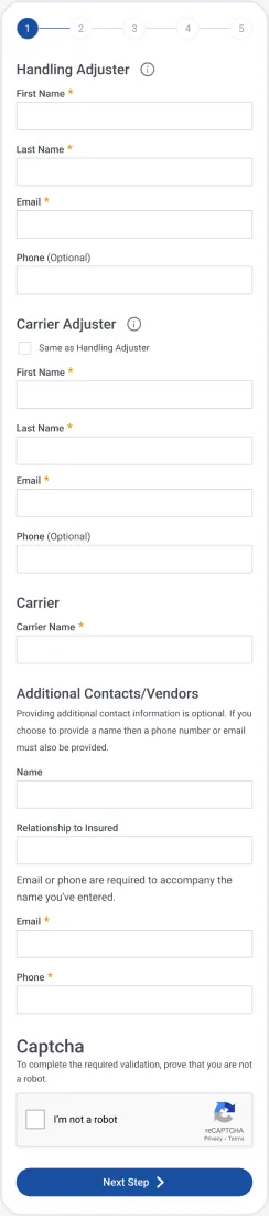
Split the submission into five topic steps with a labelled progress bar. Each step only asks about one thing: people, service, claim, policyholder, files.
The interaction
Completed steps show a check and become links. "Same as Handling Adjuster" copies details in one click. Errors appear inline under each field, with a summary under the buttons.
The result
Adjusters always know where they are and how much is left.
FEATURE 02
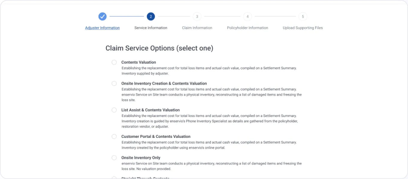
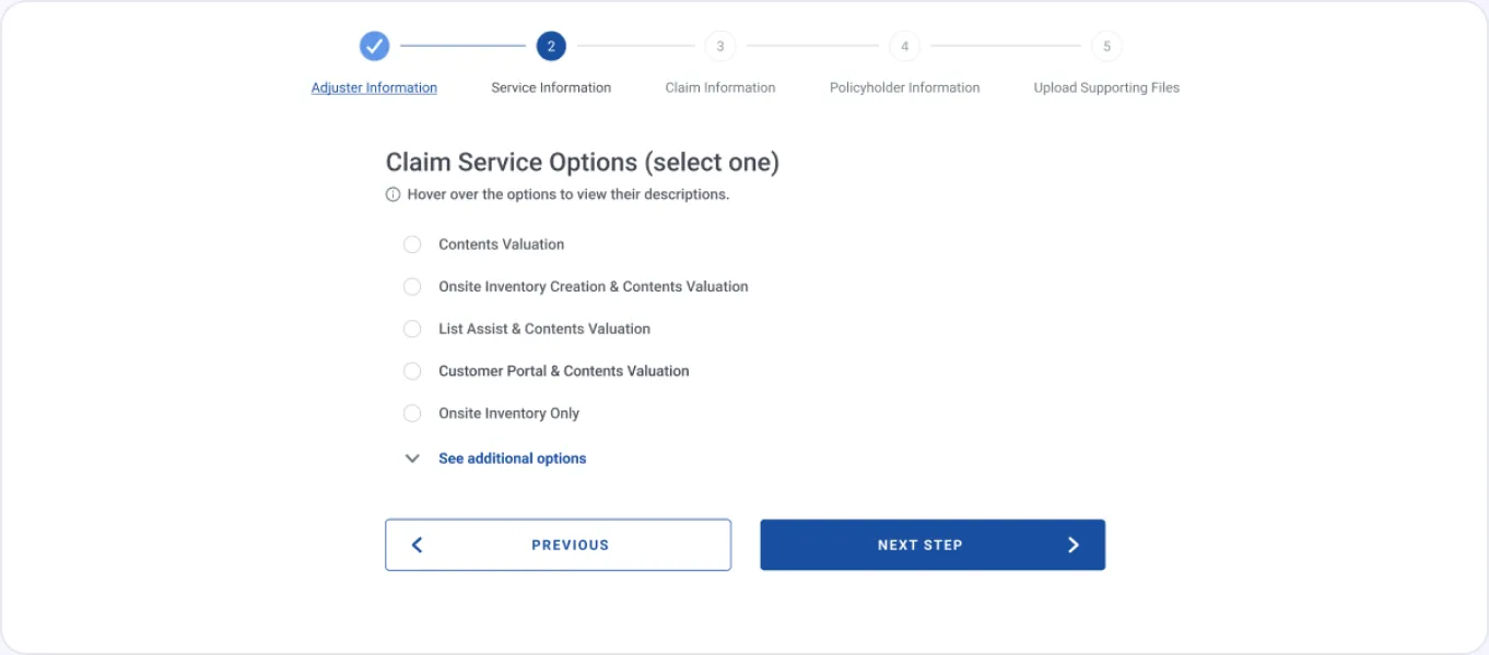
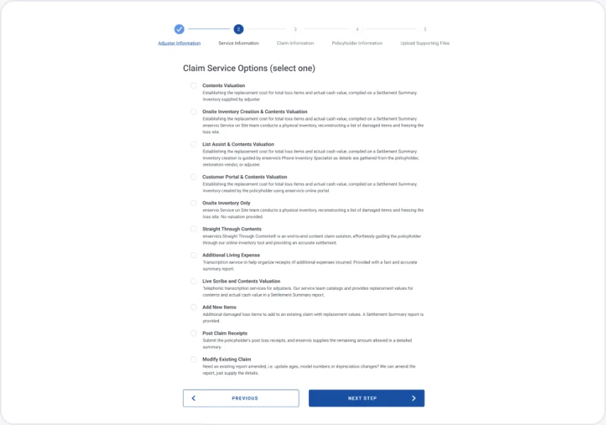
Service options that explain themselves
The challenge
Eleven services, each with a two-line description, all visible at once. Three of them were modifications, not new claims.
The design decision
Show the five most common services by name, descriptions on hover. "See additional options" expands the rest and groups modification options with an explanation.
The interaction
Picking a service opens a short confirmation that sets expectations, e.g. "please have a list of inventory items ready".
The result
A scannable list, fewer wrong picks, and the adjuster knows what to prepare before Step 5.
FEATURE 03
Smart claim and policyholder details
The challenge
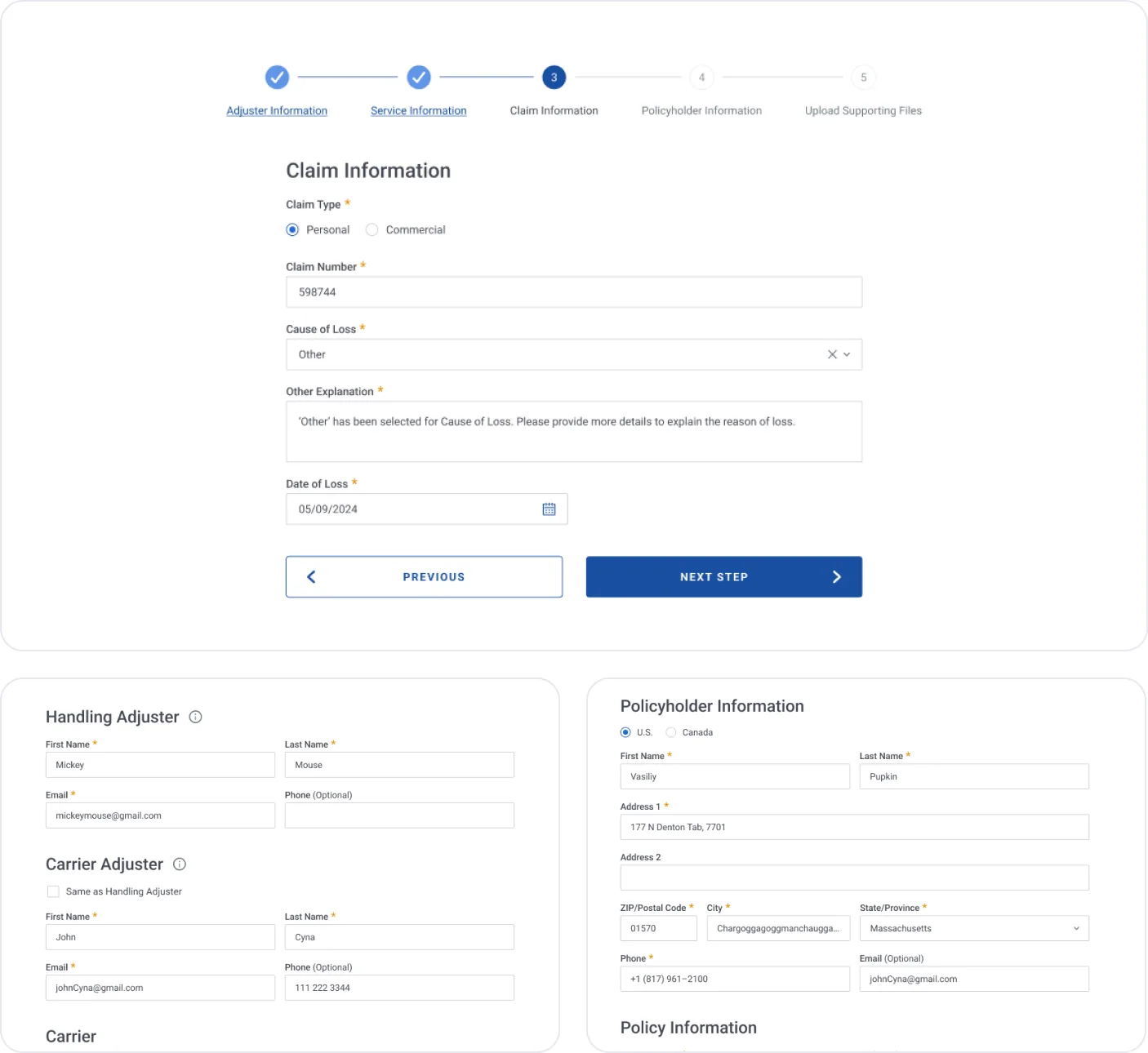
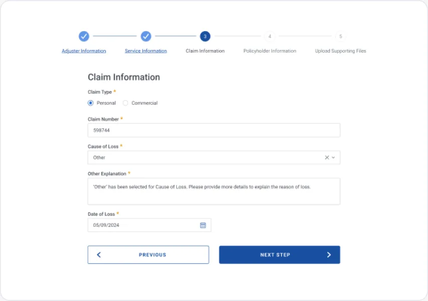
Free-text carriers and addresses produced mismatches, and "Other" causes of loss arrived with no explanation.
The design decision
Carrier typeahead matched against database values, a required explanation only when "Other" is selected, and a U.S./Canada switch where the ZIP fills city and state.
The interaction
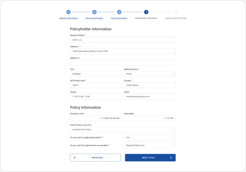
Personal and Commercial claim types swap the relevant fields; depreciation questions branch only when they apply.
The result
Cleaner data with less typing.
FEATURE 04
Uploads that lead to a complete claim
The challenge
Files arrived unlabeled, oversize or empty — and Contents Valuation claims could be sent without an inventory.
The design decision
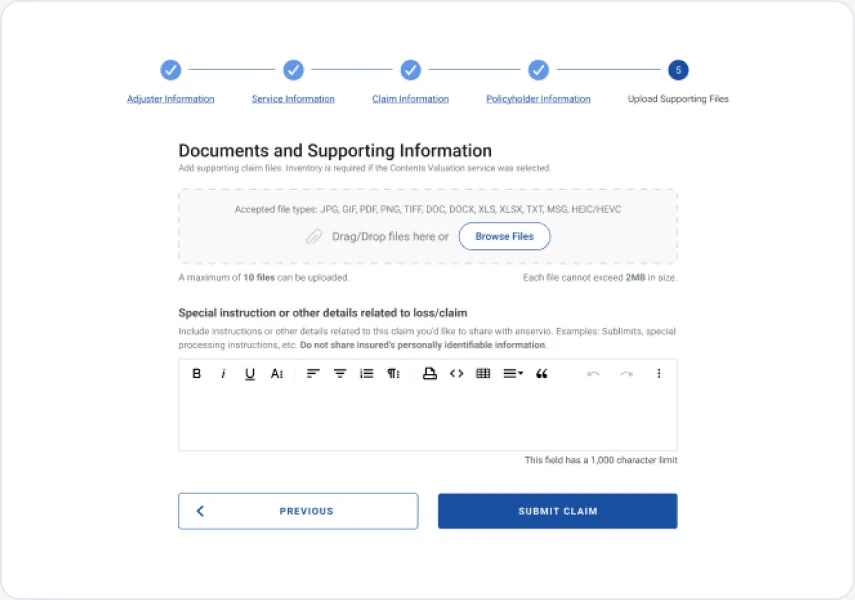
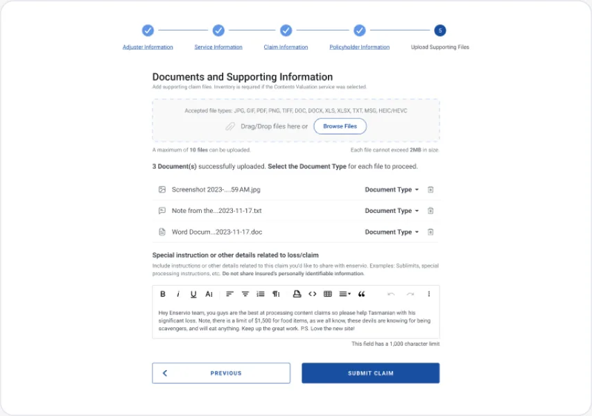
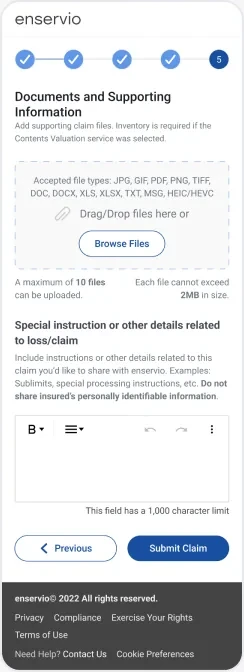
A drag-and-drop zone that states the limits up front, a document-type selector on every file, and a submit guard that explains why an inventory is required.
The interaction
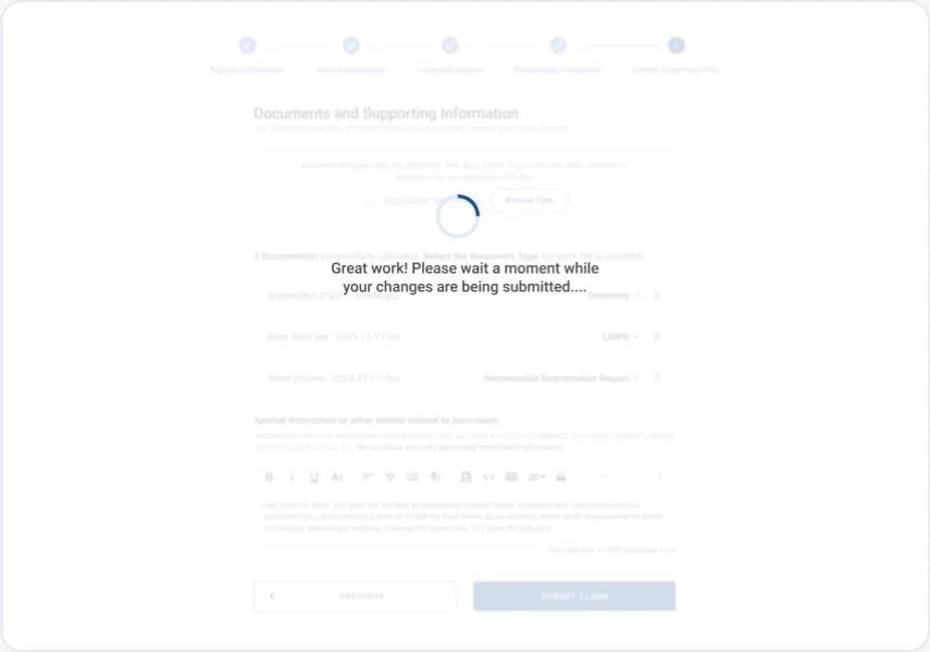
The drop zone highlights on drag. A summary counts successful, untyped and unsupported files; rows needing attention turn red. Submitting shows a reassuring progress state.
The result
Every file arrives labelled, and claims don't stall waiting for an inventory.
FEATURE 05
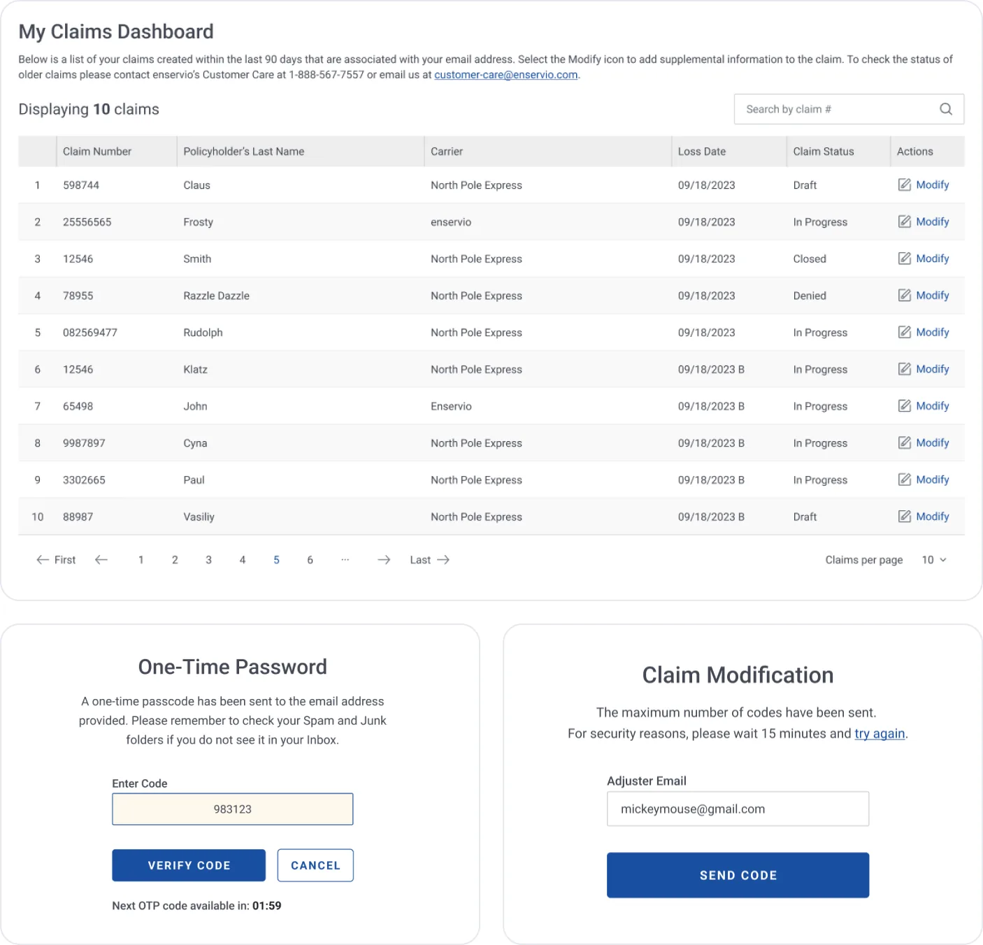
Modify a claim securely, without a call
The challenge
Adjusters needed to add items, receipts or instructions to an open claim, but had no account to log in with.
The design decision
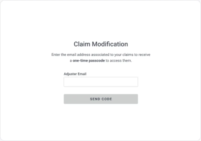
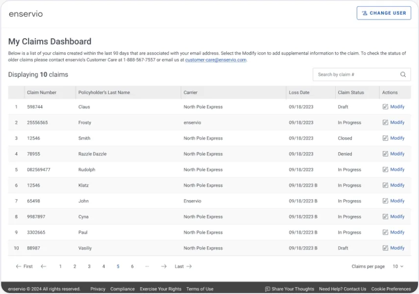
Passwordless access with a one-time passcode sent to the adjuster's email, leading to a dashboard of their claims from the last 90 days.
The interaction
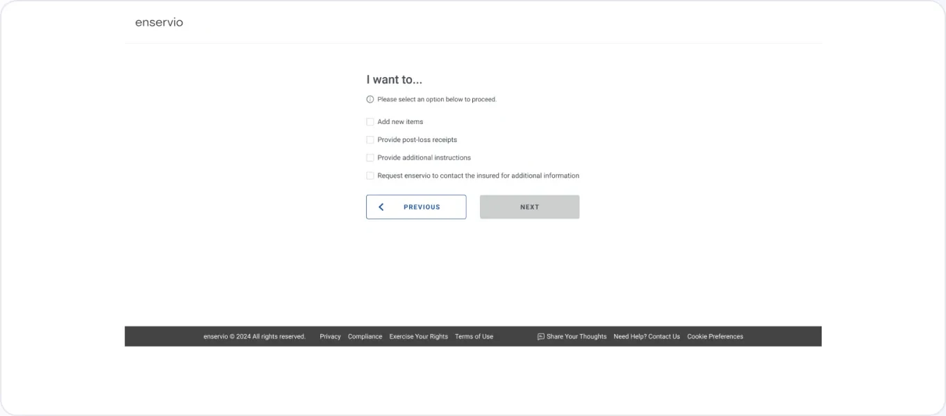
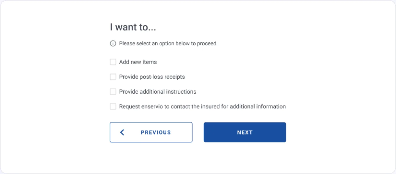
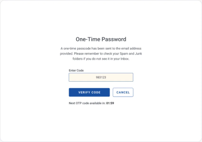
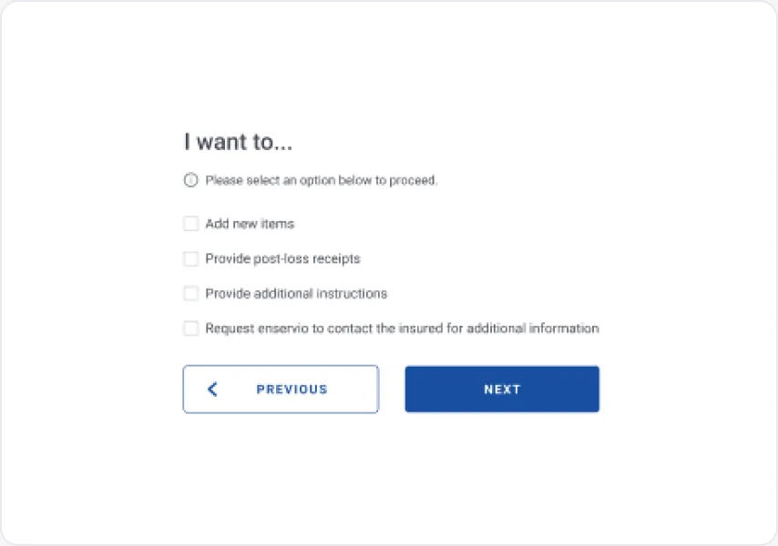
Resend countdown, a 15-minute lock after too many codes, claim search, statuses, pagination, and an "I want to…" checklist that drives the next screen.
The result
A secure, self-serve path for updates that used to go through customer care.
06 · Validation & Iteration
Testing and refinement
Each scope went through stakeholder review and UI QA. These are the changes that came out of that feedback.
Building blocks
Clickable stepper
Five labelled steps; completed steps turn into links so adjusters can jump back without losing data.
Two-column fields
Paired fields, an orange asterisk for required and "(Optional)" spelled out where it's not.
Standard modal
One modal pattern with a blue top bar for confirmations, warnings and session messages.
Upload manager
Drop zone, per-file progress, document-type selector and delete for every file.
Inline alerts
Dismissible notices with a colour-coded side bar for info, warning and error.
Typeahead
Carrier and policy-form search against database values, with a custom-value fallback.
Rich-text instructions
Formatted notes with a 1,000-character limit and a reminder not to share PII.
Tooltips
Info icons on section titles explain roles such as Handling vs Carrier Adjuster.
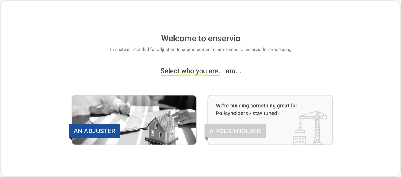
Policyholders clicked into a path built for adjusters.
Change
Disabled the card with a clear "We're building something great for policyholders" message.
Why it matters
It sets the right expectation instead of a dead end.
File manager · individual progressexplorationFile manager · type one file at a timeexploration
07 · Final Experience
Bringing everything together
The full adjuster journey, from the welcome page to "Thank you!".
Submit a new claim
Landing
01
Pick adjuster or policyholder
Choose a path
02
Pick adjuster or policyholder
1 · Adjuster Information
03
Adjusters, carrier, contacts
2 · Service Information
04
One of 11 services
3 · Claim Information
05
Type, cause and date of loss
4 · Policyholder Information
06
Policy & depreciation
5 · Upload Supporting Files
07
Files plus instructions
Document types
08
Every file labelled
Submitting
09
Reassuring progress state
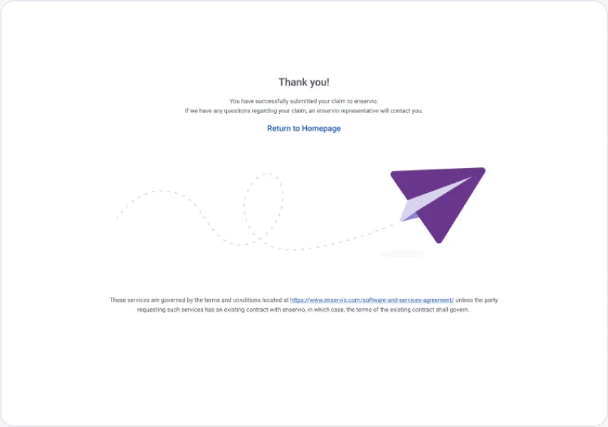
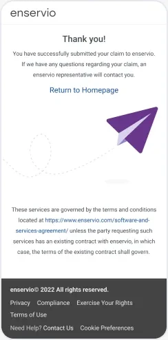
Thank you!
10
Confirmation & return home
Modify an existing claim
Enter email
01
Request a one-time passcode
OTP: Verify code
02
Resend after countdown
My Claims Dashboard
03
Search, statuses, Modify
I want to…
04
Pick what to add or change
Responsive layouts
Desktop
Large (≥1200px)
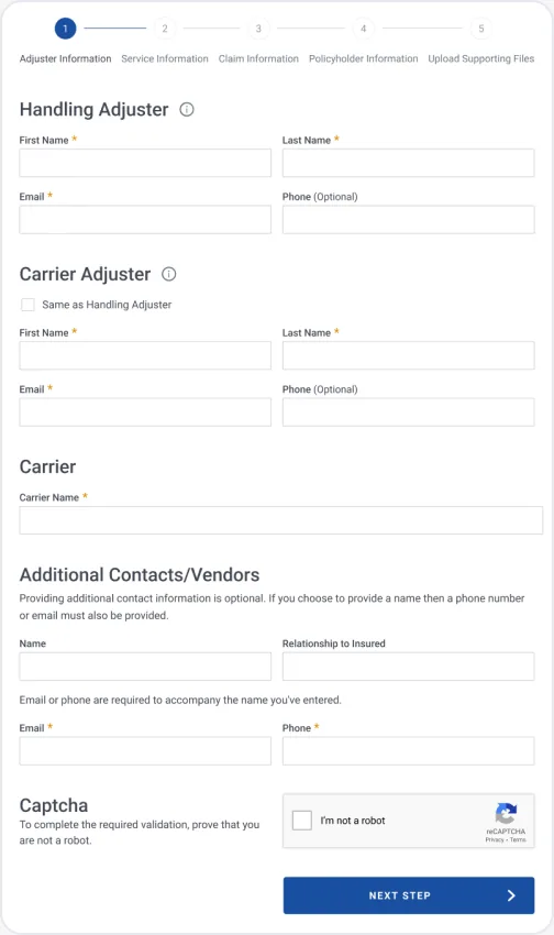
Tablet
Medium: ≥768px
Mobile
Adjuster Info
Mobile
Uploader
Mobile
Confirmation
Edge cases & system states
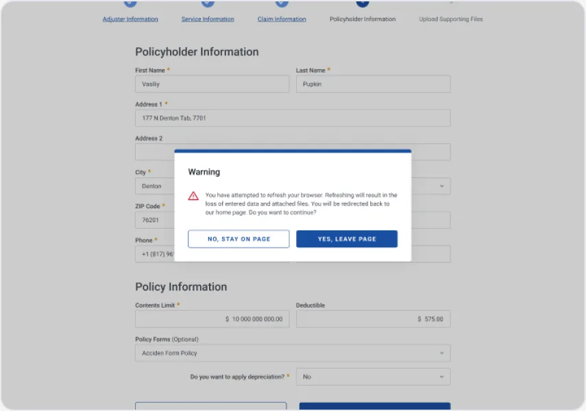
Refresh warning
01
Stops accidental loss of data and files
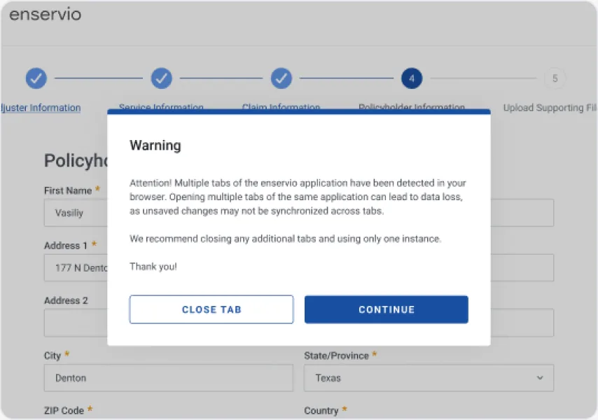
Multiple tabs
02
Warns that changes may not sync
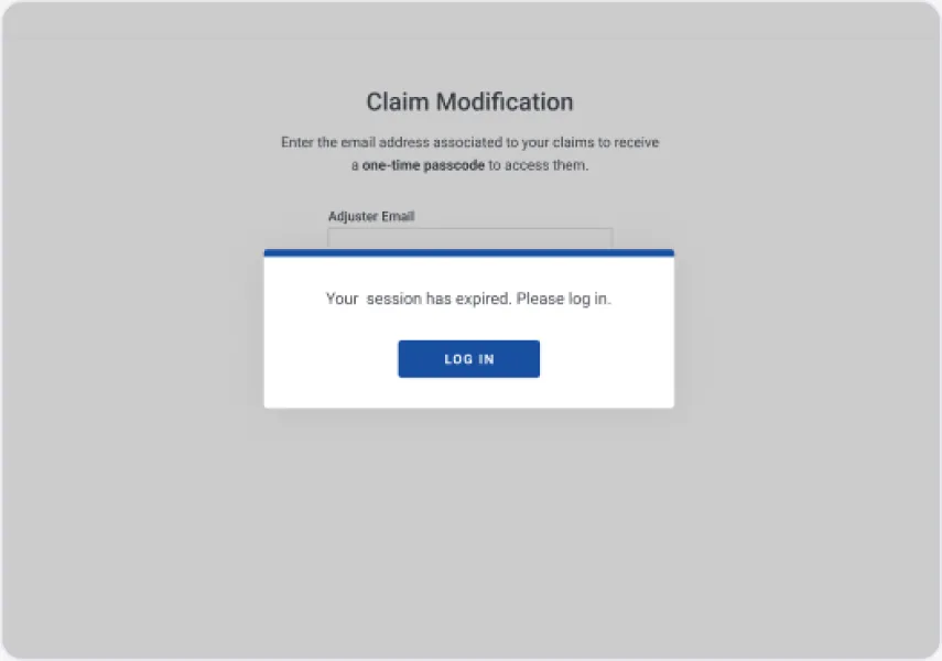
Session expired
03
Log in again, email field focused
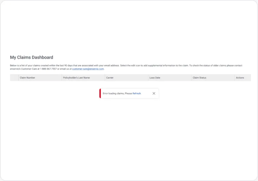
Transient error
04
Inline retry on the dashboard
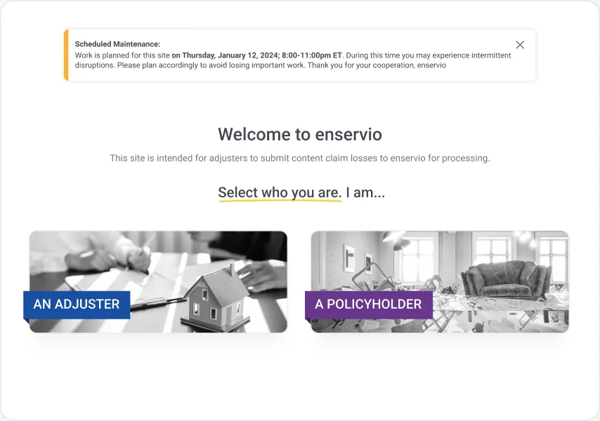
Maintenance
05
Planned downtime announced ahead
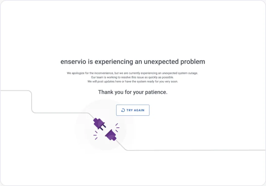
Unexpected outage
06
Apology, status and Try again
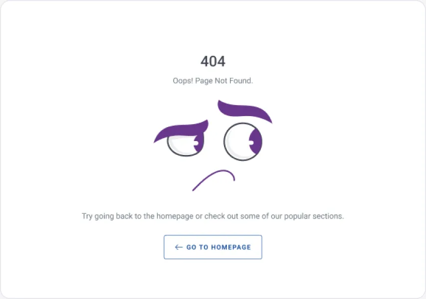
404
07
Branded, with a way home
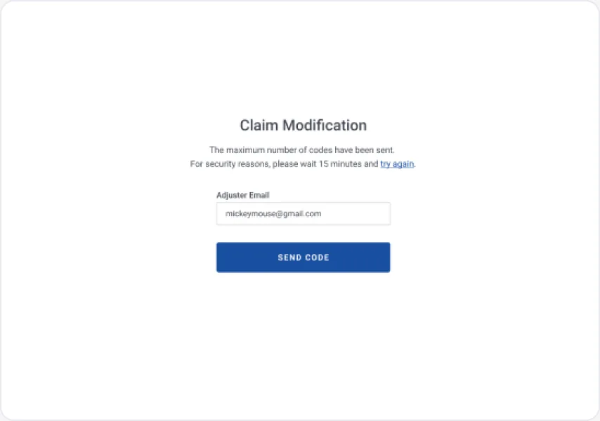
Rate limit
08
Max codes sent, wait 15 minutes
08 · Outcome & Learnings
Impact and reflection
From a single long form to a guided, resilient claim portal with a self-serve path for changes.
01→
The outcome
Delivered desktop, tablet and mobile specs for the five-step flow, claim modification with OTP and the dashboard, then 24 UI-modernization stories handed off to engineering through Jira and UI QA.
02↑
The impact
One consistent pattern library for forms, modals and alerts; required inventory and document types enforced before submit; and claim updates moved from phone and email into the portal.
03✎
What I learned
In B2B forms, the biggest wins come from where explanations sit and how errors recover, not from visual polish. Designing every failure state early saved rework at QA.
With more time I would…
Measure completion time and drop-off per step to confirm where adjusters still struggle.
Add save-and-resume drafts so long claims survive timeouts and interruptions.
Design the policyholder path that's currently marked "coming soon".