• Toyota OEM
  • Dealership
  • Automotive
  • DealerSocket
  • Vehicle Inventory

2019 — 2021Toyota OEM Themes

OEM Dealership WebsitesHelping dealership customers find the right vehicle, faster

+100
Screens
+300
Dealership websites
+3
Themes
Mission
Unification, Simplicity
MY ROLE
UX/UI Designer
TIMELINE
2 year
PLATFORM
Desktop · Responsive
TEAM & TOOLS
VP, PM, Devs, Sales
https://dealership.com/new-inventory
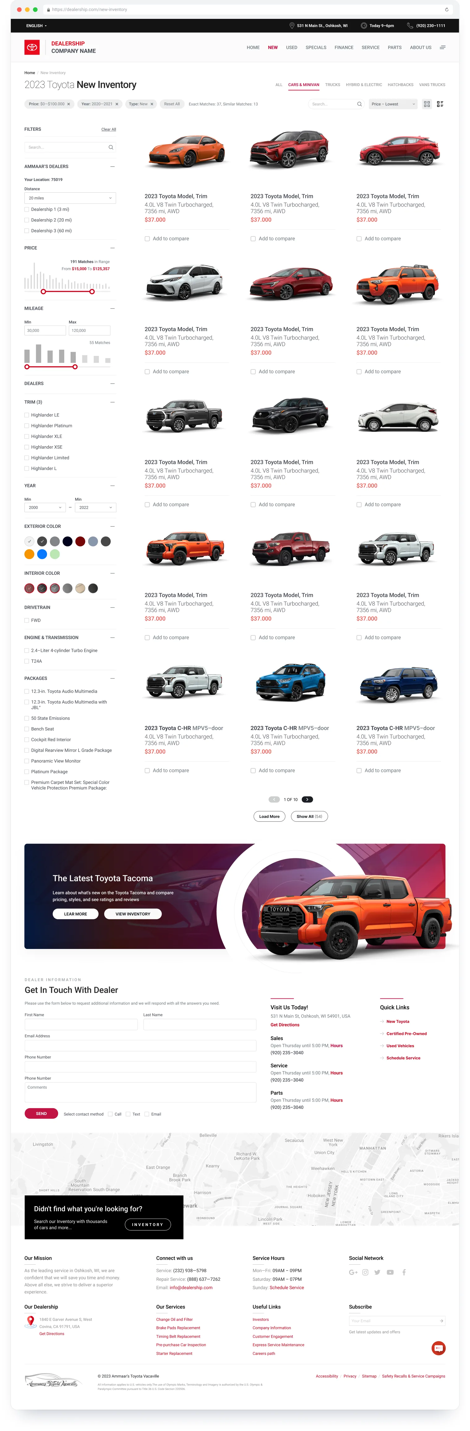
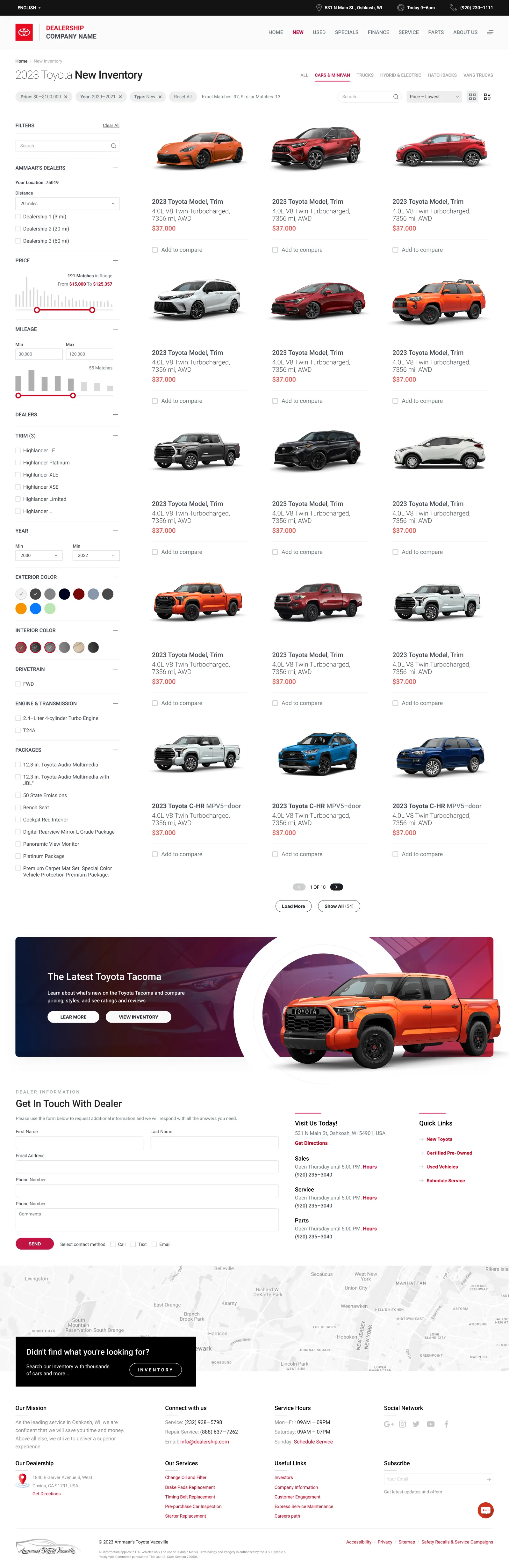
The redesigned 2023 Toyota New Inventory page, from the header to the footer: filter sidebar on the left, applied filter chips and a grid of vehicle cards, a Tacoma promo banner, the dealer contact form, map and footer

A redesign of the Search Results Page (SRP) for a Toyota dealership website — the page where shoppers browse new inventory, narrow it down with filters and choose which cars to look at in detail.

Understanding the problem
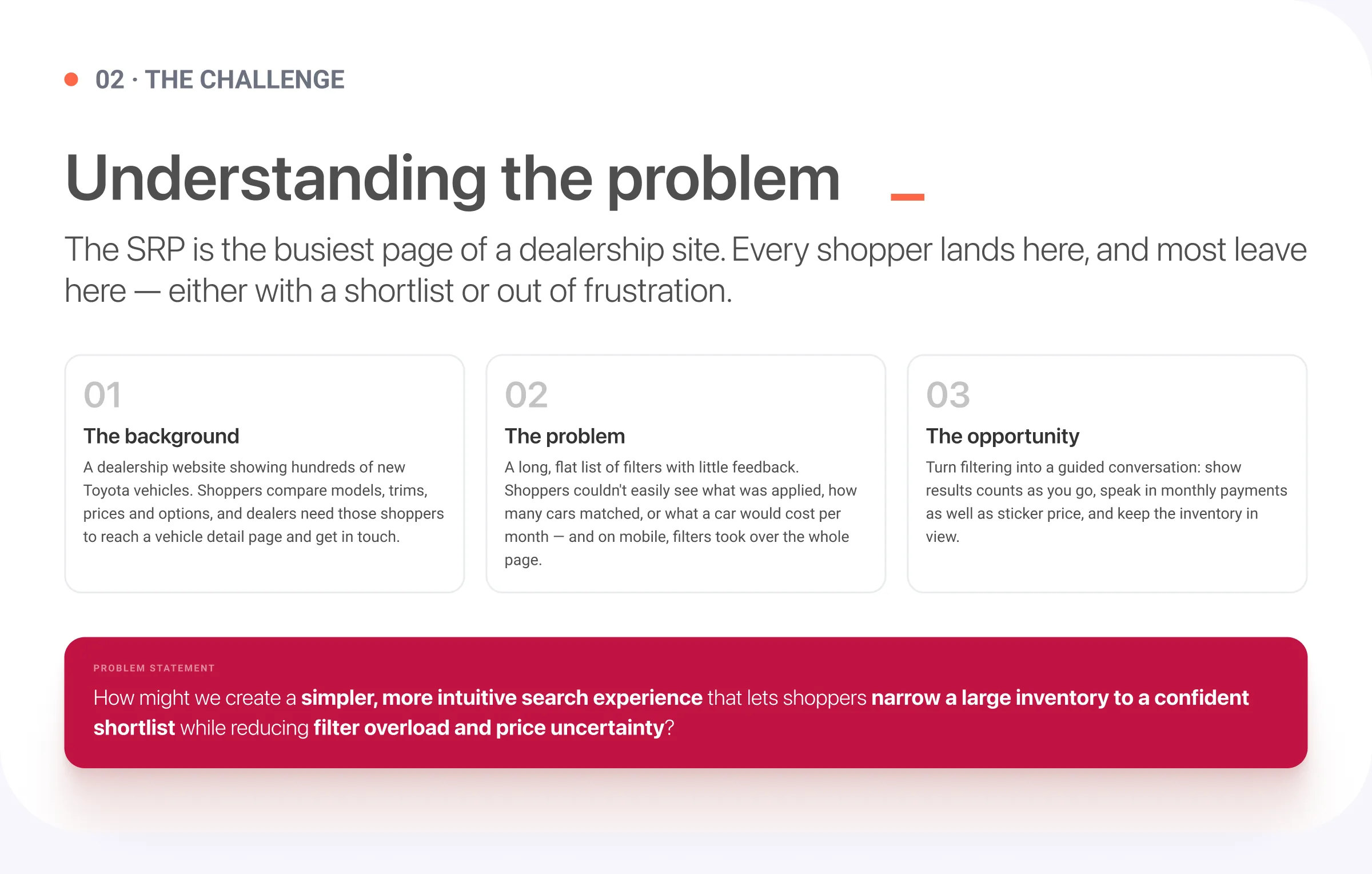
02 · The challenge. Understanding the problem: the SRP is the busiest page of a dealership site. The background, the problem and the opportunity, and the problem statement: how might we create a simpler, more intuitive search experience that lets shoppers narrow a large inventory to a confident shortlist while reducing filter overload and price uncertainty?

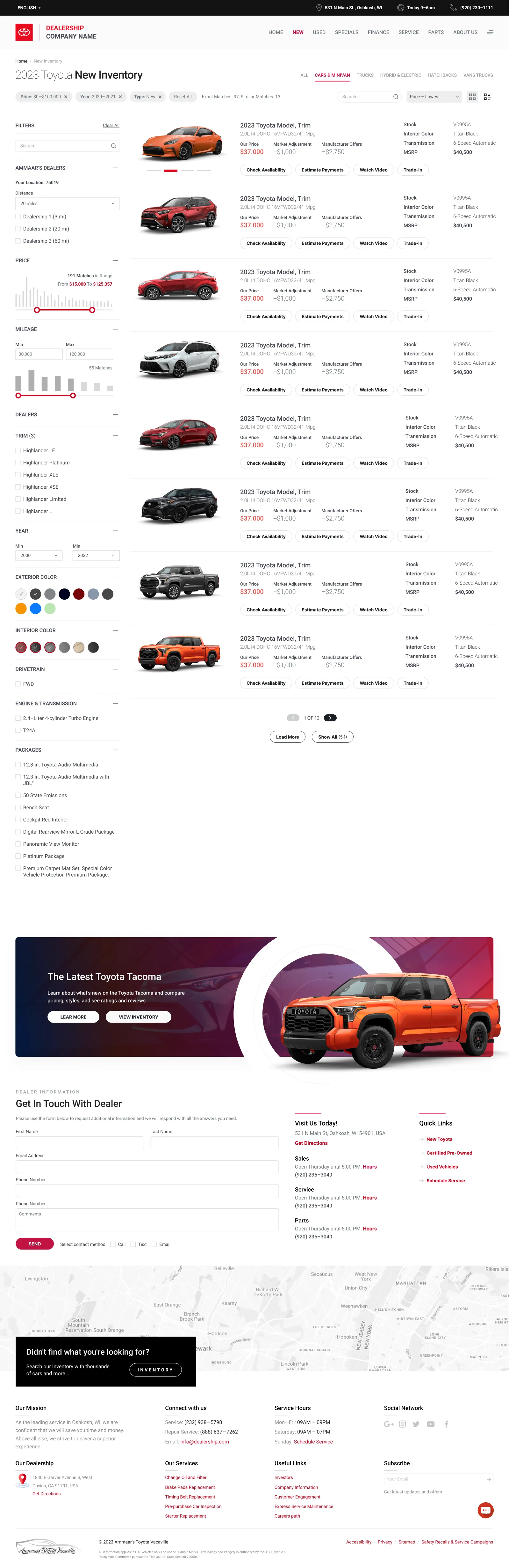
01 List View

We designed experience with a simple, intuitive flow that aligned with user expectations, ensuring a clear product vision at this stage. One of the key advantages of scaffolding systems is their simple, intuitive assembly.

https://dealership.com/new-inventory
List view of the New Inventory page: each vehicle is a wide row with its photo, price, specs and action buttons, followed by the promo banner, contact form and footer

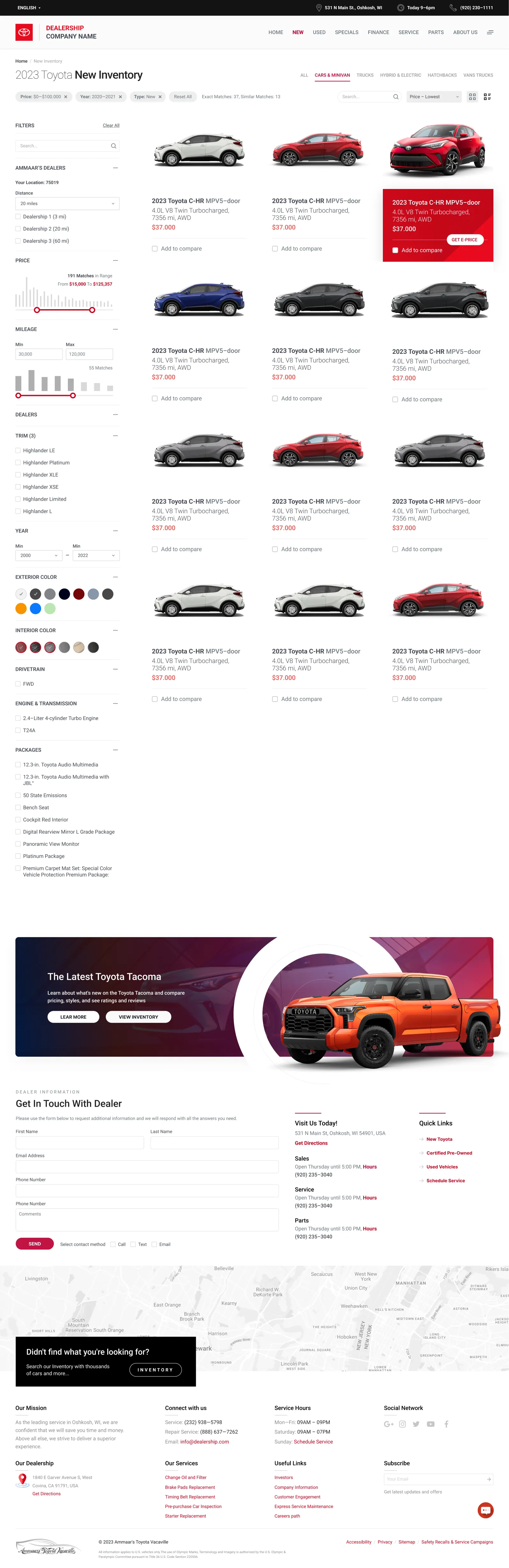
02 Tiles View

We designed experience with a simple, intuitive flow that aligned with user expectations, ensuring a clear product vision at this stage. One of the key advantages of scaffolding systems is their simple, intuitive assembly.
https://dealership.com/new-inventory
Tiles view of the New Inventory page: a grid of vehicle cards next to the filter sidebar, with a red promo tile, followed by the promo banner, contact form and footer

Understanding users and workflows

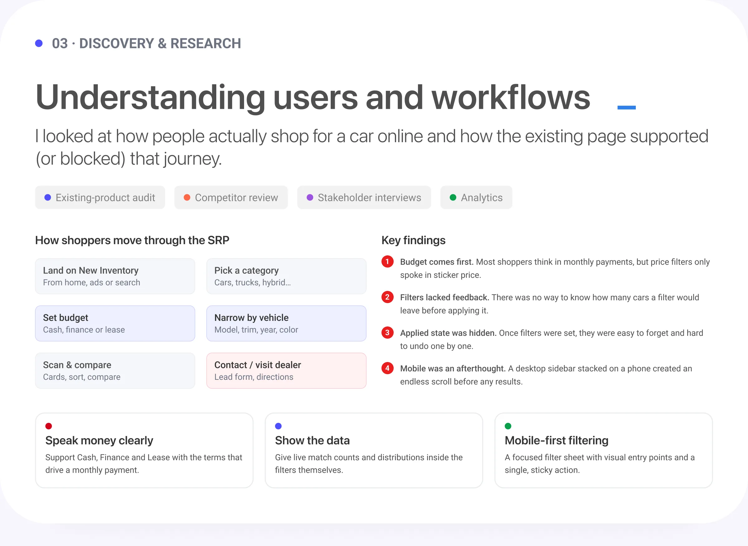
03 · Discovery and research. Understanding users and workflows: how shoppers move through the SRP, the key findings, and three takeaways: speed is trust, show the math, and mobile-first filtering

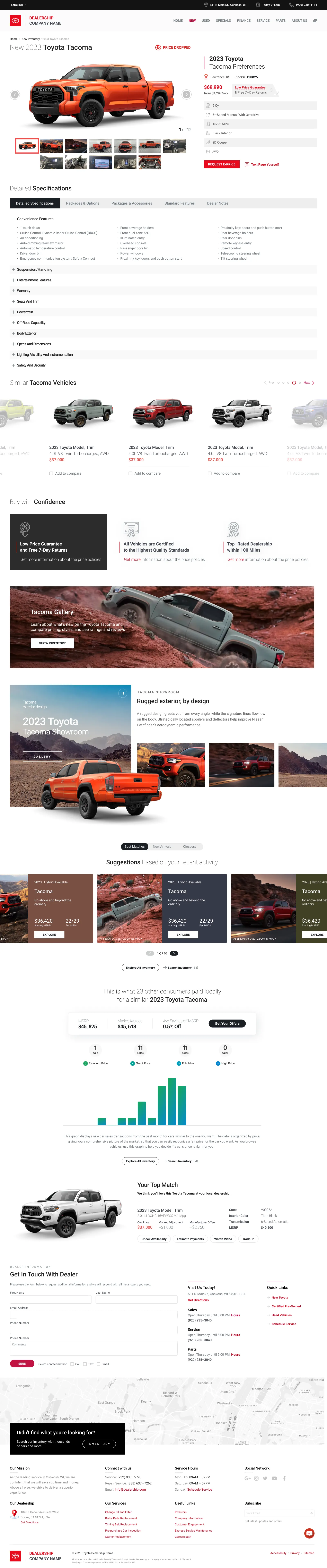
03 Vehicle Details

We designed experience with a simple, intuitive flow that aligned with user expectations, ensuring a clear product vision at this stage. One of the key advantages of scaffolding systems is their simple, intuitive assembly.
https://dealership.com/new-2023-toyota-tacoma
Vehicle details page for a 2023 Toyota Tacoma: photo gallery, price, key specs, detailed specifications, similar vehicles, the Tacoma gallery and showroom, suggestions, a price comparison chart, the contact form and footer

Defining the experience

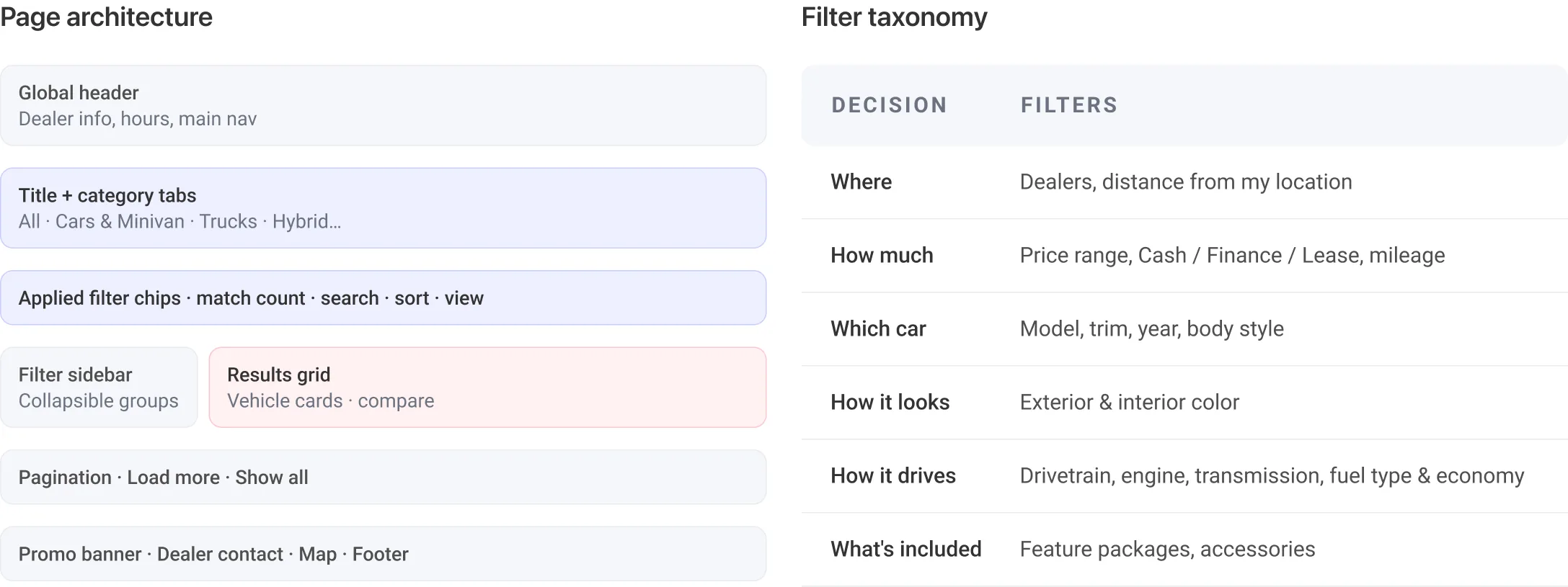
04 · Design strategyDefining the experience. I restructured the page around one rule: results stay the hero, filters stay one glance away. Then I grouped 15+ filters into the order shoppers make decisions.Page architecture from header to footer, and the filter taxonomy grouped into location, price, vehicle, features and dealer

Building blocks

Before laying out pages I designed a small kit of filter components — search field, segmented payment toggle, dual-thumb range slider, checkbox lists with “select all” toggles, color swatches and collapsible group cards — so desktop and mobile could share one language.

Filters

Your Location: 75019

173 Matches in Range
From $15,000 To $125,357

51 Matches

Filters

Your Location: 75019

173 Matches in Range
From $15,000 To $125,357

51 Matches

Search

$0 - $35,500

At least 17 MPG City
All Transmissions
All fuel type
All packages
All accessories
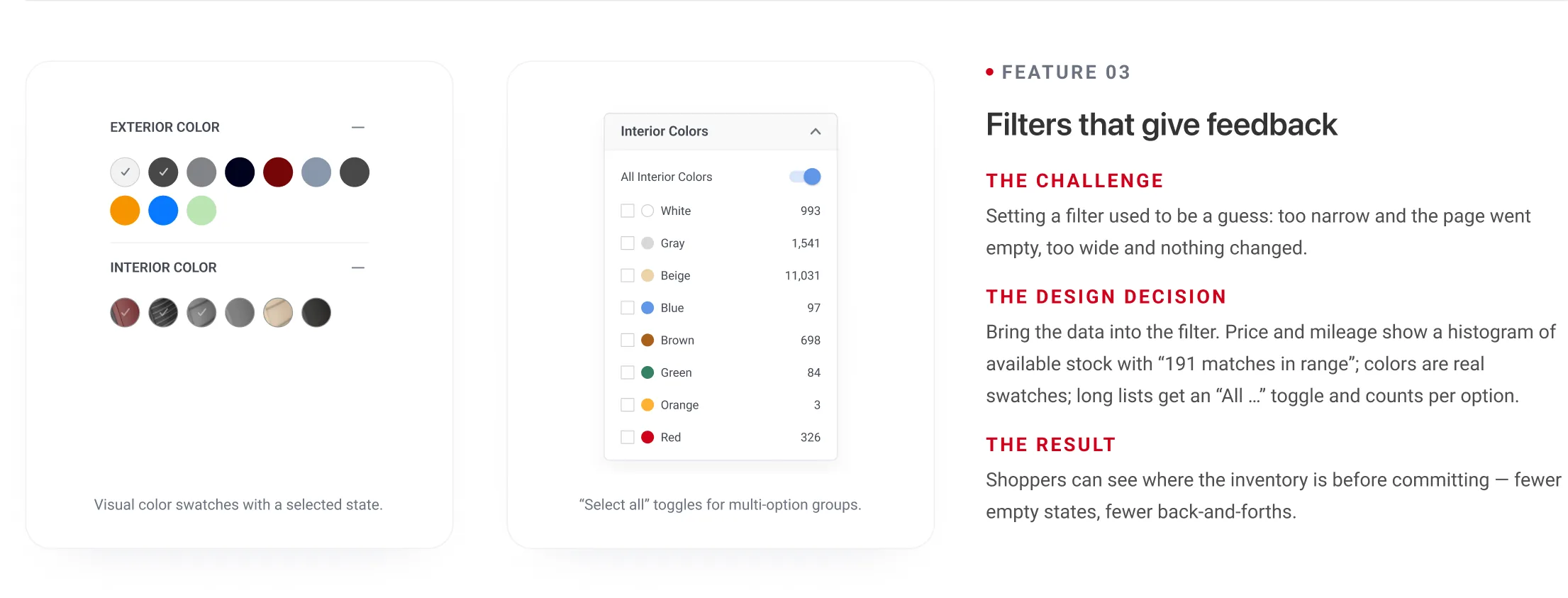
All Interior Colors
Price Range

$0 - $35,500

to
Price Range

$18,500 - $35,500

72 mo. @ 5.9%, $4,500 down

Search
Brands
Price Range

$100 - $500

Transmission
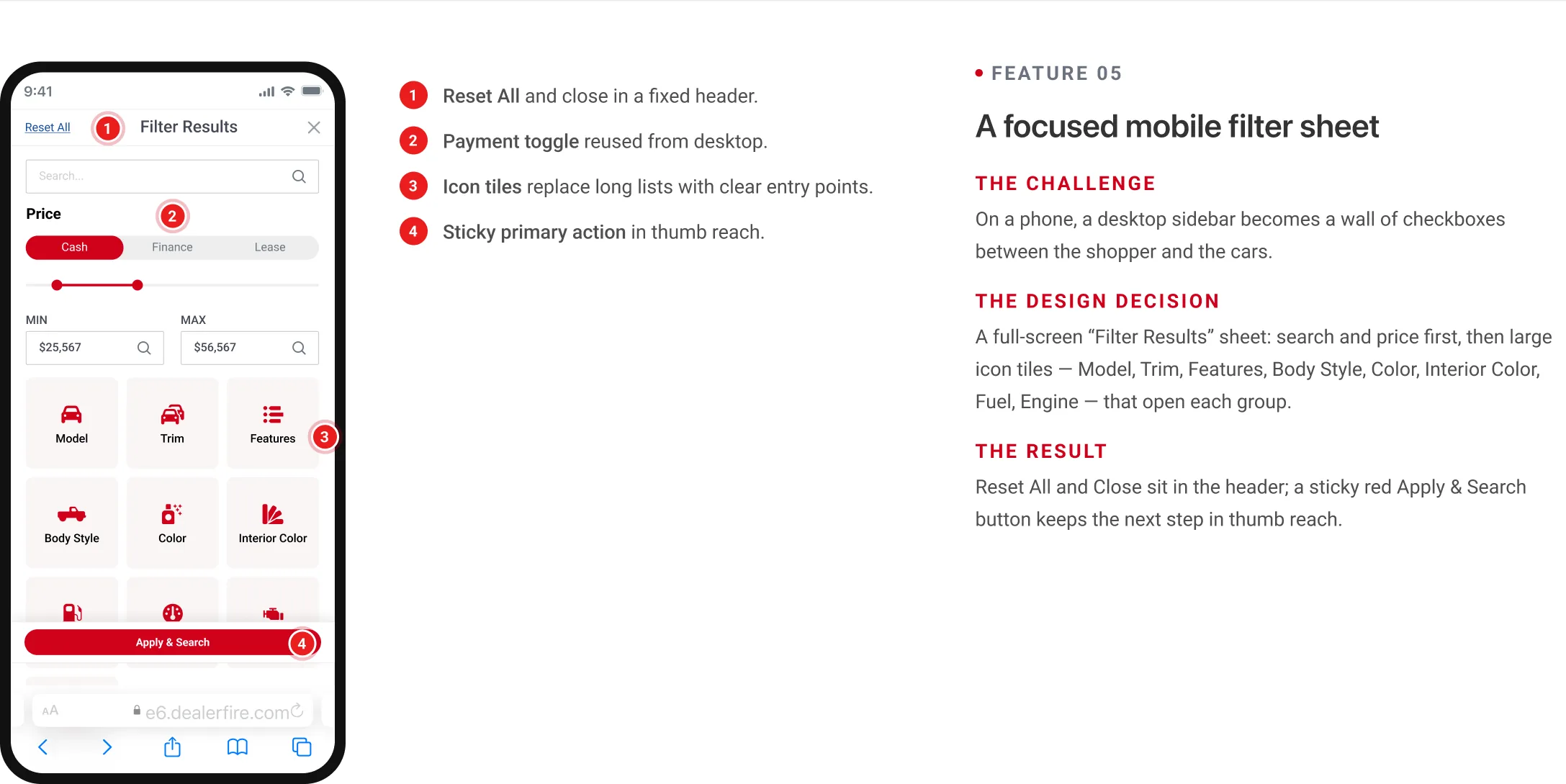
Filter component kit — section cards, payment toggle, range sliders and the mobile sheet.

Key design features and decisions
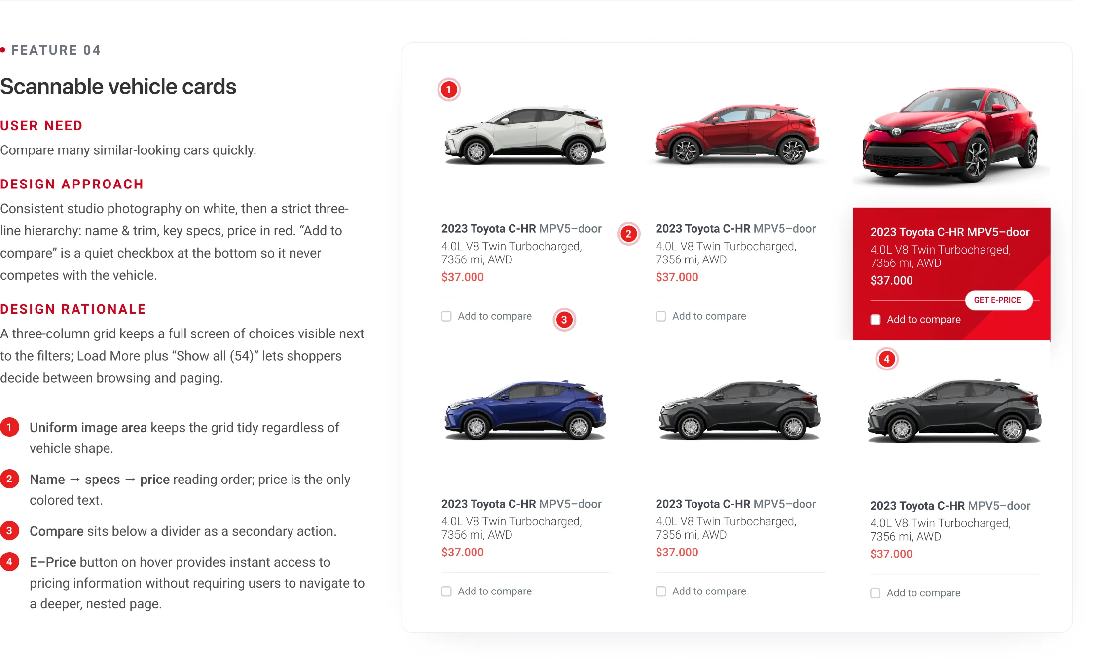
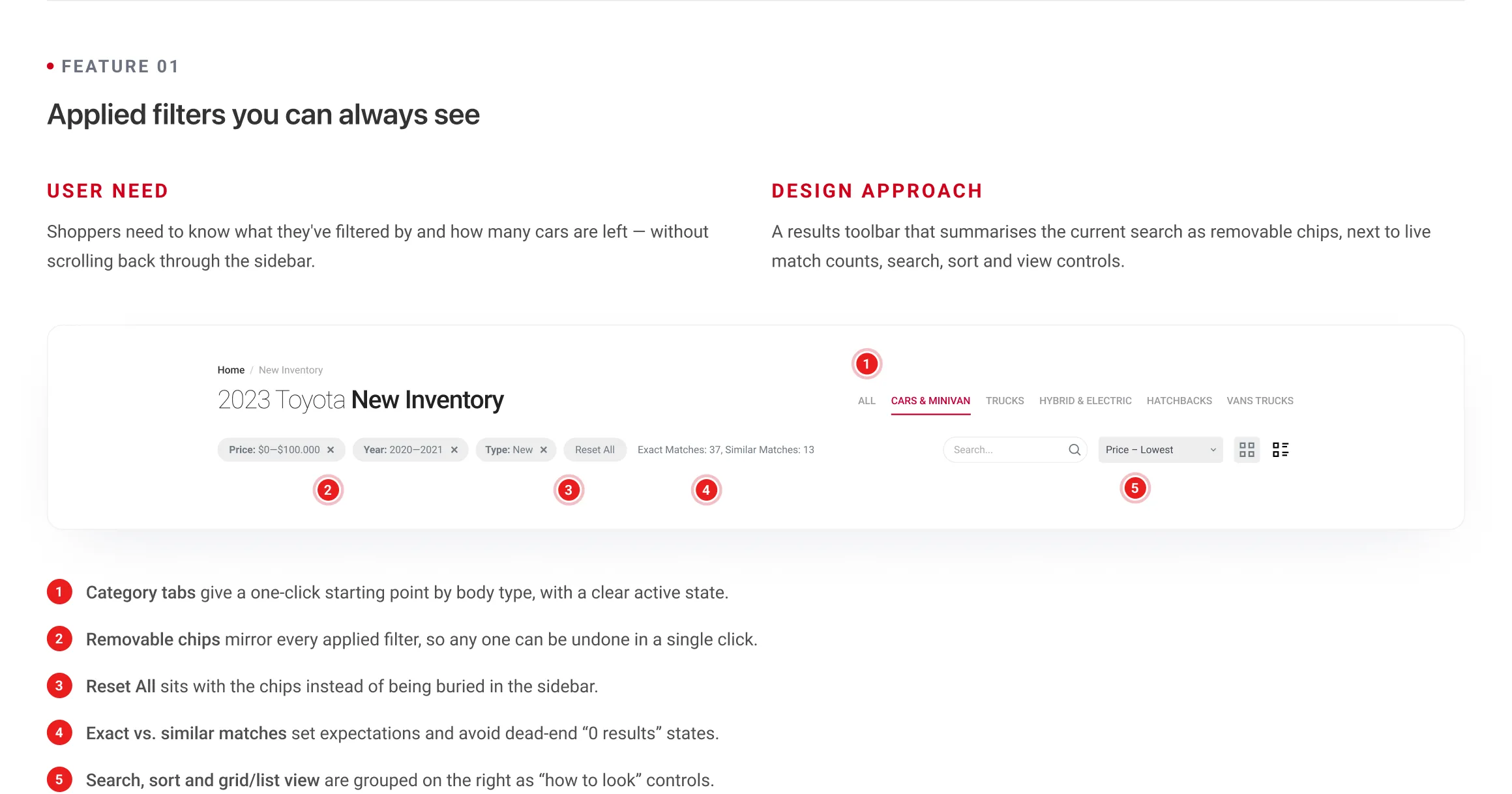
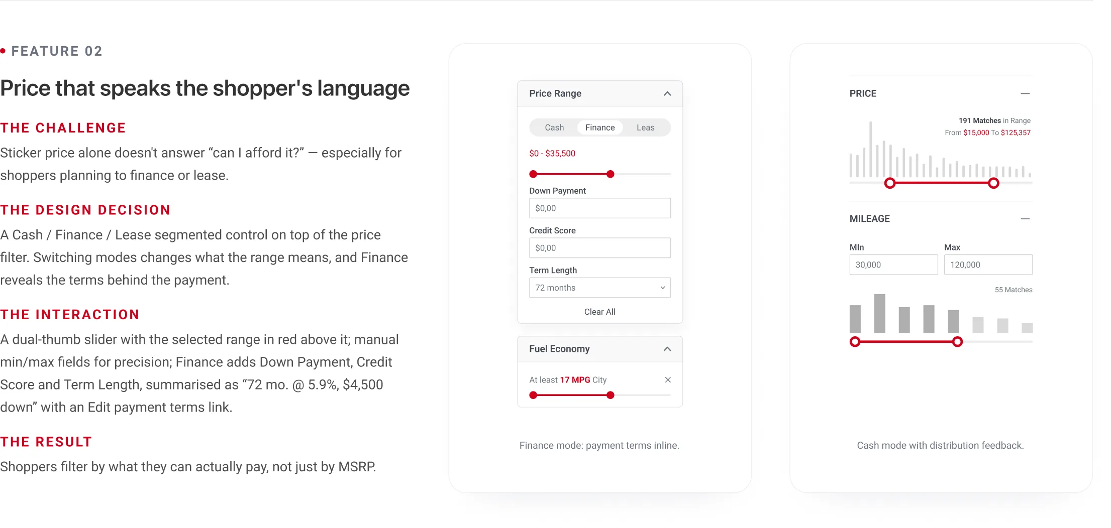
05 · The solutionKey design features and decisions. Five stories that explain the most important decisions on the page.Feature 01, applied filters you can always see: the toolbar with removable filter chips, result counts, search, sort and view switchFeature 02, price that speaks the shopper's language: Cash, Finance and Lease tabs with down payment, credit score and term, next to the price histogramFeature 03, filters that give feedback: color swatches and checkbox lists with per-option countsFeature 04, scannable vehicle cards: the grid of cards with photo, model and trim, specs, price and Add to compareFeature 05, a focused mobile filter sheet: the filters open as a full-screen sheet on a phone with a sticky results button

Testing and refinement

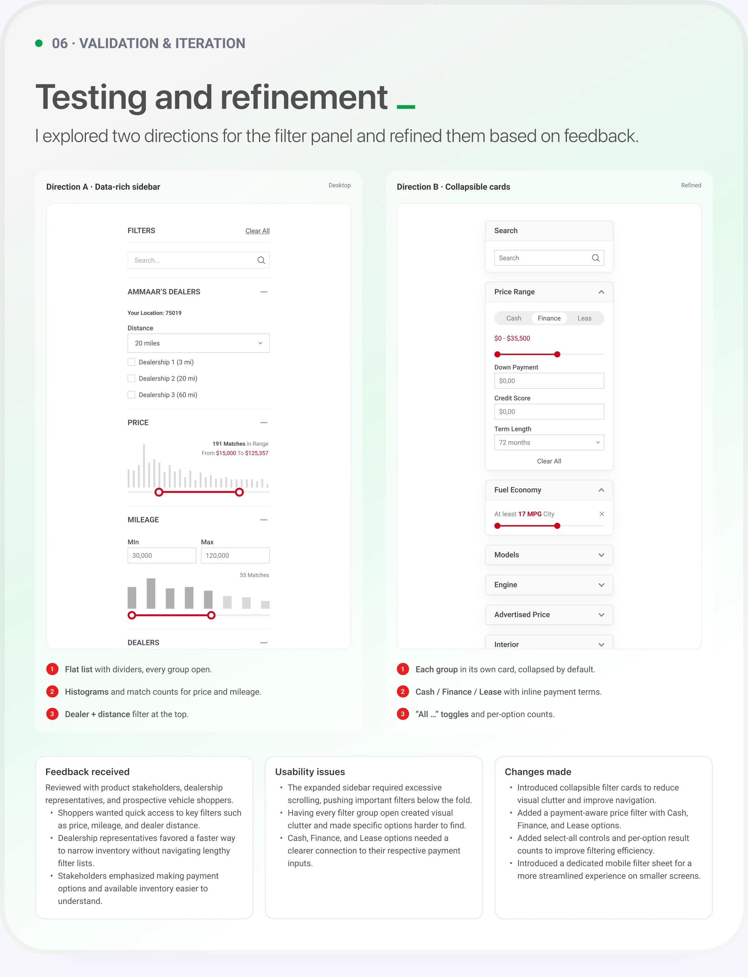
06 · Validation and iteration. Testing and refinement: Direction A, a data-rich sidebar, against Direction B, collapsible cards, with the feedback received, the usability issues and the changes made

Bringing everything together

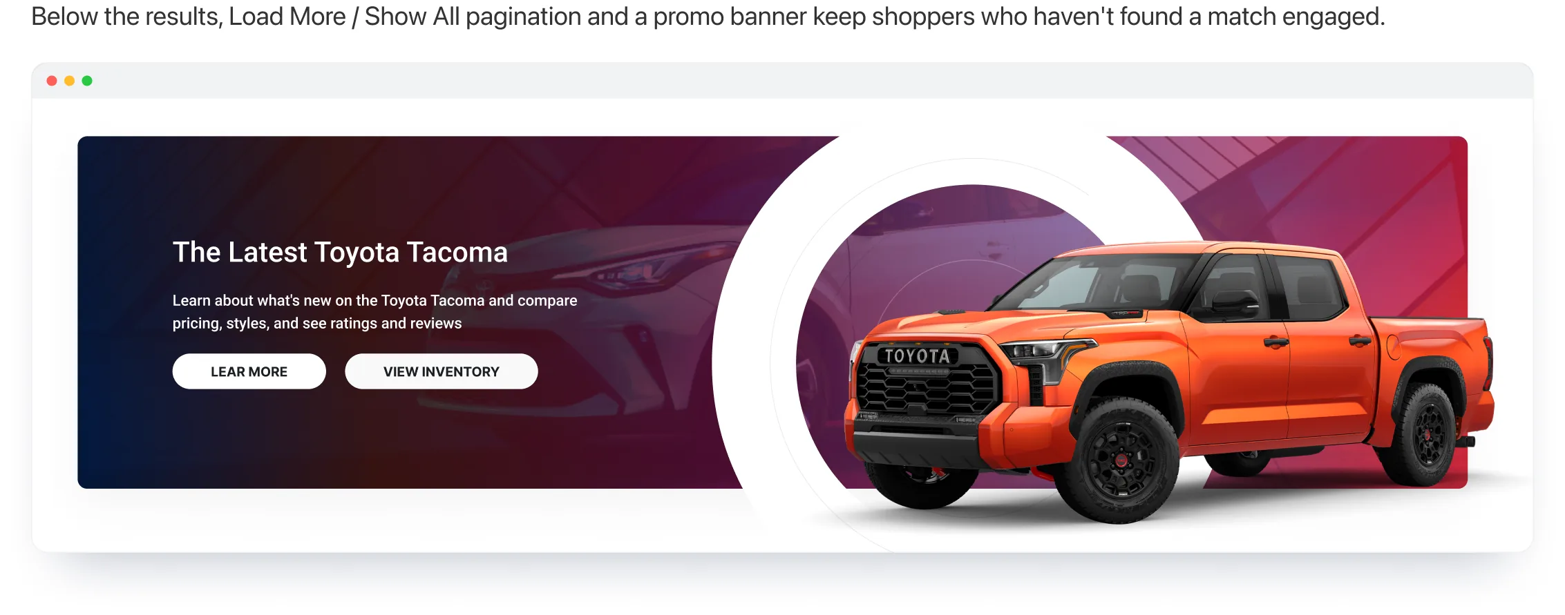
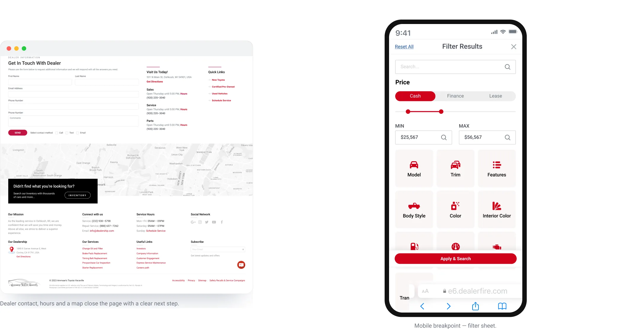
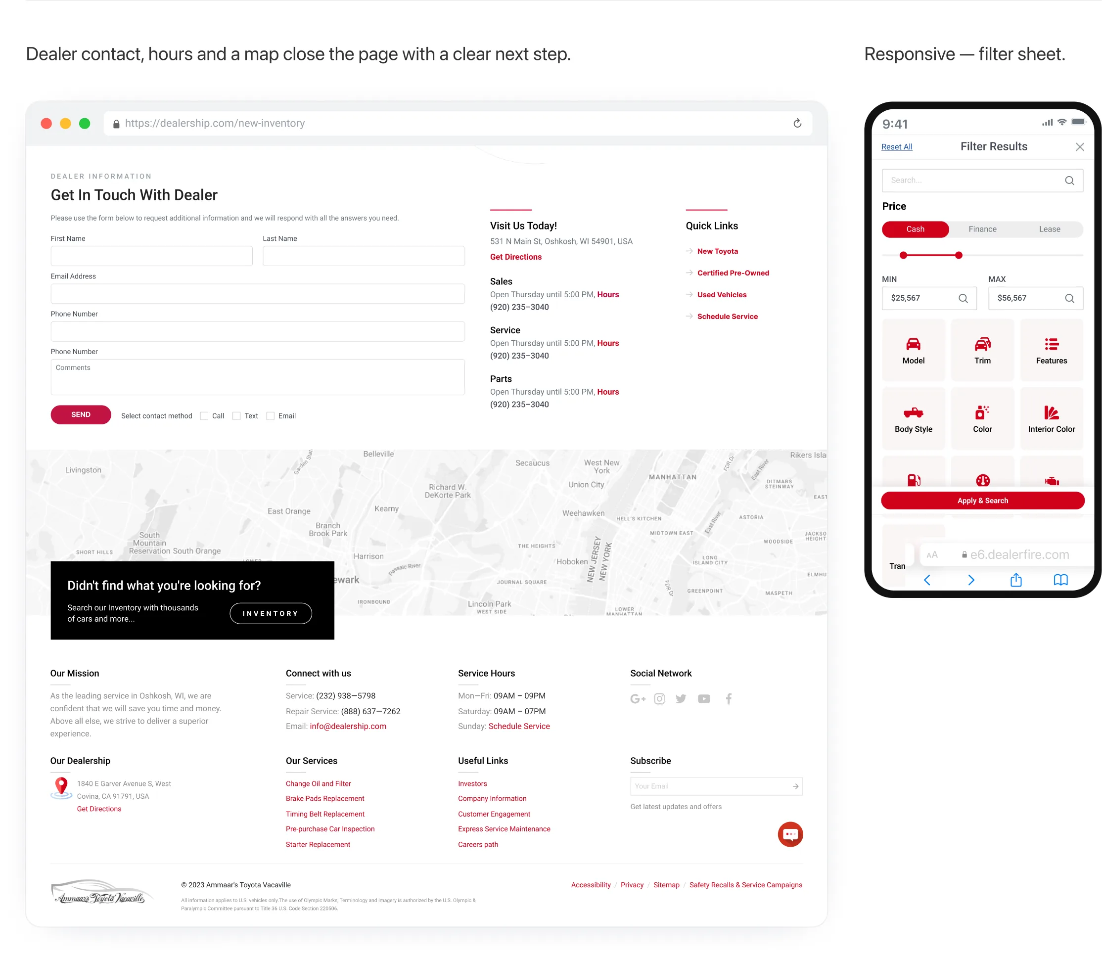
07 · Final experienceBringing everything together. The complete desktop page, from the header to the footer.The complete desktop New Inventory page: header, filters and vehicle grid, pagination, The Latest Toyota Tacoma promo banner, the dealer contact form, map and footerBelow the results, Load More and Show All pagination and a promo banner keep shoppers who haven't found a match engagedThe dealer contact section and the page on a phoneDealer contact, hours and map on desktop, and the responsive filter screen on mobile

08 · OUTCOME & LEARNINGS

Impact and reflection

Five stories that explain the most important decisions on the page.

  • 01

    The outcome

    Delivered a refined, responsive filtering experience with collapsible sections, payment-aware pricing, and simplified navigation.

  • 02

    The impact

    Reduced visual clutter, improved filter discoverability, and made it easier for shoppers to narrow down vehicle inventory.

  • 03

    What I learned

    The importance of prioritizing high-value filters, reducing cognitive load, and aligning filtering experiences with real shopper needs.

With more time I would…

  1. Test the Finance and Lease flows with real shoppers and connect them to the dealer's payment calculator.
  2. Explore saved searches and inventory alerts for shoppers who don't find a match today.
  3. Design a full compare view for vehicles added from the grid.